Steve Fleming

Artist Studio

Steve Fleming

Tag: demonstration

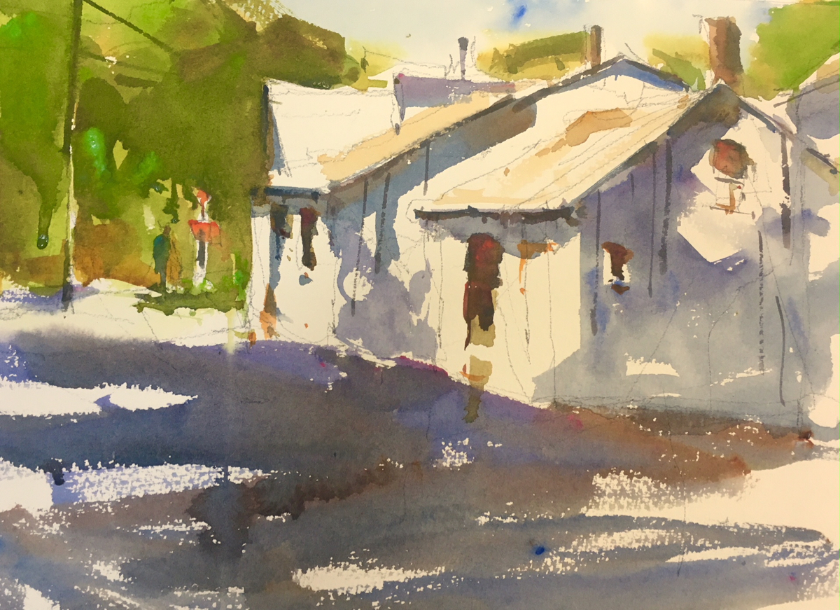
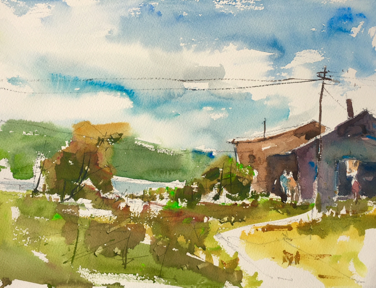
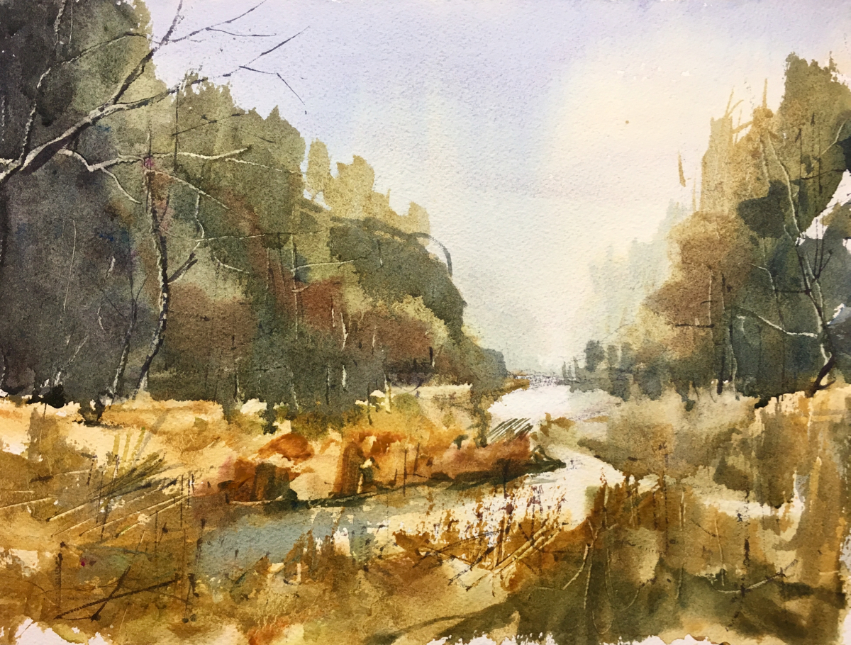
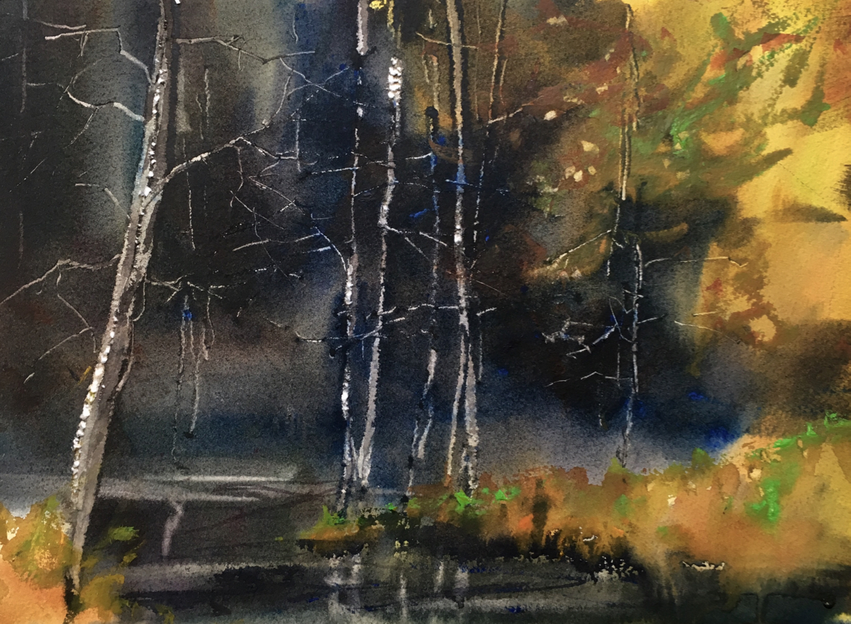
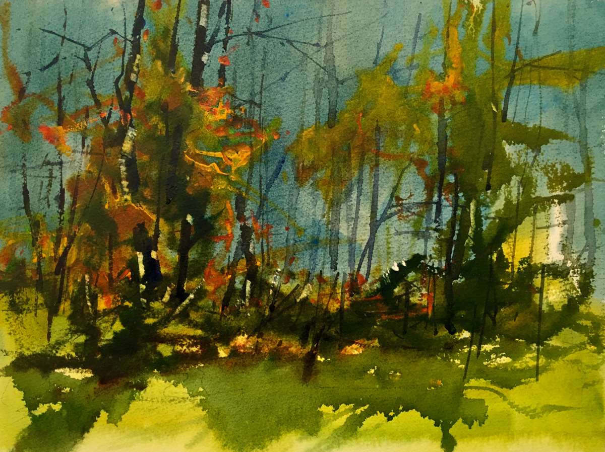
Light and Shadow, Watercolor Demonstration

This lesson is based on working from a 3 to 4 value, lights, darks and middle value, value pattern, then sketching it on the paper using lines, not the shaded values. Using a sketch as opposed to a photo offers you the opportunity to design your own composition, pick your own color palette, and to

In The Studio: Edit the image to make a better painting

Today I want to show you a demonstration about editing and painting from a very complicated and unfocused image. This image of a harbor in Maine has a lot of interesting things to represent, the foggy atmosphere and distant islands, the lobster boats with terrific reflections, and the foreground with the weeds and textures.

Friday was a mostly sunny day, that was sweet

I worked on creating a scene from very generic buildings and foliage.  I rearranged the buildings and exagerated the sky to create movement towards the center of interest the buildings and added some figures for a little bit of humanity.  I think it worked out okay but I was hoping for a little more detail and representational content but I ended up here.  It is hard in 45 minutes to teach a lesson and paint a painting that has lots of finish and detail.

Landscapes are about impressions not reality

The lesson was to try to create the feeling of depth using atmospheric perspective, which basically means things that are far away are cooler and less intense and have less texture. As you move closer to the front of the picture plane the colors are more intense, there is more texture and more detail. This is a over-simplification but it is fairly accurate.

In The Studio: Day 1 of Rockport, Maine Workshop Pemaquid

Today we started the workshop at Pemaquid Point and it was a fabulous day with light winds and cool temperature.  As one of my long time students said it was the best day ever at Pemaquid.  I definitely agreed. My lesson was to take the complicated and simplify everything down to 4 to 5 value

Watercolor and a Poem

This watercolor was a demonstration for one of my class.  The lesson was pretty simple.  I wanted to achieve rich darks, that were very translucent and then I wanted to get well times scrapes using a pen knife. It is hard to produce this level of dark colors if you rub them into the paper.  Also stay away from the dark staining colors they don’t scrape or lift very well.   I never expected it would lead me to this poem about how confusion and frustration can lead to so much lack of focus.

In The Studio: A new watercolor demonstration

This demonstration had two components in the lesson the first was the concept of contrast and the second was using a rigger to create wonderful textures.  All successful paintings are build on contrasts: contrast of value, color, shape, size, line and every element of design.  This means contrast warm against cool, dark against light, soft

In The Studio: Two watercolor demonstrations, same image

This week I used the same image for my watercolor classes and ended up with 2 similar but distinctly different finished paintings.  I give myself about 30-45 minutes to present the lesson and to do the completed painted.  Interesting this is the same amount of time I give for my oil demonstrations but if the

“Seagulls” Oil Demonstration

I finished this painting last week, which I did as a demonstration in Rockland Maine in September.  I had to correct a few values that were a little wobbly.  The water behind the rocks and gulls was too light making it impossible to see the birds.  The water under the rocks needed some darker reflections