This lesson is based on working from a 3 to 4 value, lights, darks and middle value, value pattern, then sketching it on the paper using lines, not the shaded values. Using a sketch as opposed to a photo offers you the opportunity to design your own composition, pick your own color palette, and to test your ability to create from memory, you will like this approach if you stick with it. I tried to paint an expressive piece, which I find easier when working from a sketch, images usually trap me into a box of rights and wrongs. Photographic images are necessary to use for accurate drawing, establishing details, and interpreting light in a factual way. The center of interest of this demonstration is the two figures and the gulls coming in over the water. I really wanted to paint the gulls without getting too crazy and detail-oriented, they are texture and local interest. Try to find some little unique landscape element that you can have fun with in your painting without getting carried away
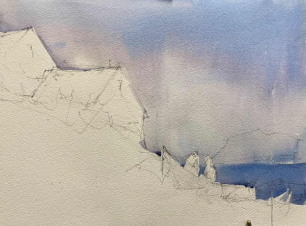
here is my value sketch and you can see my interest in the gulls. I have indicated the direction of the light and left out most detail.

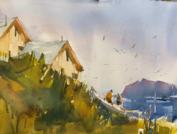
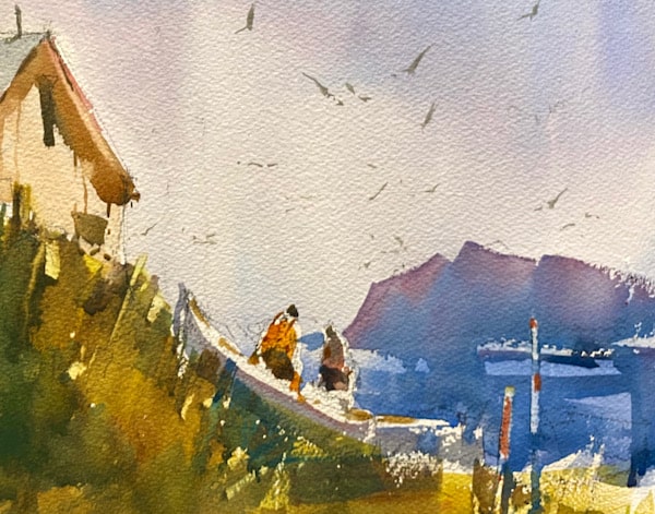
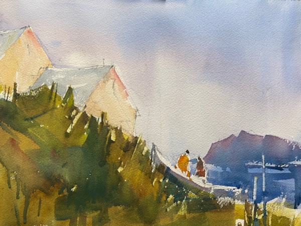
Here is the finished painting followed by a detail of the figures and the gulls. Notice that I have put the figures in a nice location, just off center, and the gulls up in the right quadrant which also helps to create a non-centered focal point, this is always a good idea to stay away from the middle.
I just think the gulls are fun. I tried to really capture the expression of the figures and to keep them very loose while accurately interpreting the light according to the light on the building.
After I drew in the major shapes and of course realized that I had left the shapes hanging in the middle of the paper, what a dumb mistake but I redrew it three times and I wouldn’t move to save my life. So now my motto, “you can leave it in the middle of the paper just paint it well and leave some nice edges. I think I did. The color of the sky is a graded wash of Ultra, cobalt, and cerulean blue with a hint of permanent Rose Madder and the water is the same mix just darker. I only wet the top of the paper above the building and cut around the figures.
So here things get a little dicey color-wise, I have a really strong blue rose background island and a conflicting yellow green foreground, but I liked the colors so to remedy the problem, I mixed a awash of purple rose and brushed it with the sky flow brush over the foreground and I think it fixed it. By the way, I am painting with 1.5 sky-flow wash brush which is giving me nice bold color and flat washes. I can’t get too detailed with the sky-flow. After the paint set up just a little, I scraped the weeds and a couple of poles behind the figures and the boat. These pole scrapes keep the painting from sliding off the paper on the right side, they push the viewer back up into the painting.
I paint the light side of the building with yellow ochre and permanent rose, lightly wash the rooftops with a cool gray mixed with cobalt blue and a hint of burnt umber, and painted the figures with a number 8 round. At this point it is really important that the values are working or else this painting would fall apart and become boring. I left the light on the figures and a little on the rails of the dory boat.
I put in the shadows using a darker mix of the yellow ochre and rose, and I made a slight lift under the eaves of the buildings to capture the feeling of reflected light and indicated the windows and doors, trying to keep everything in balance value wise, nothing too dark or watery light. I cast a few shadows on the roof and darkened the shadow forms on the figures and painted the gulls. I do like that area of the painting. This was quite fun working from a value sketch as opposed to a photo, seems like old times.

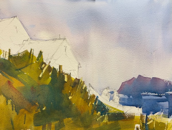
You can see that if I left the painting like this, it would lack a lot of details and center of interest. Don’t be afraid to step and add some fun, some excitement, and some atmosphere to your painting, you will be rewarded with sales and a feeling of achievement
Those gulls add so much life and atmosphere to the painting, and this becomes obvious when comparing the final painting with the gull-less (is that a word) example.
Thanks, Alan, That was actually the point of the demonstration, where you put in details is very important and it should be a pre-thought before starting a painting. I am in the process of categorizing the site so many things will not seem available but they will be in the next few days. Steve