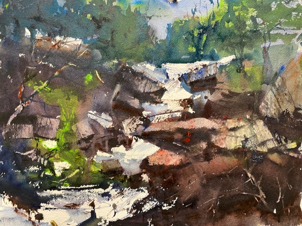
The goal of this demonstration is simple, just make a nice white shape and surround it with nice rich dark colors. See very simple. I have compressed my view down to just the middle portion of the image and left everything at the bottom out. When I started the painting, I wet the paper except where the white water was going to be. It is hard to make lifts that have the same visual power as pure white paper. Once I started the painting, I didn’t think about painting things I just thought about getting dark rich color variety with warm cool contrast. So, paint a painting with an interesting shape of pure white paper, use this painting or do something of your own but try to make it powerful and colorful. Rich colorful darks come from using lots of pigment and less water and the white shapes are most interesting with a variety of edges, you will see texture and transitional values used to give the shapes more character. The scrapes happen when the paper has just lost its’ glisten. Have fun, just paint with a purpose and don’t try to copy, just paint with a confident brush. Thanks for reading this demonstration.
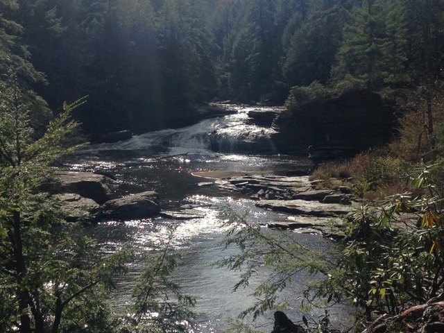
After drawing the major shapes, keeping in mind designing a powerful moving white shape that starts in an interesting place and has movement, I proceed to paint the rich darks around the white shape. In this painting, the white shape starts in the upper left works through the middle of the painting and then goes out the bottom left of the paper. As it moves along the painting, the dark rocks and foliage work against the white shape, creating interesting shapes and a variety of edges. The colors I am using are neutral tint, cerulean blue, burnt sienna, permanent rose and skip’s green a proprietary color from Cheap Joe’s. I am painting with very think color and just enough water to make it flow and I am varying the edge of the number 16 round brush to get exciting edges.
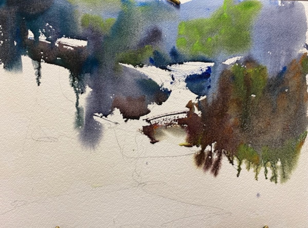
The upper part of the painting is painted in very cool hues, greens, blues and neutral tint and as I come forward in the painting, I am using much warmer colors: burnt sienna, permanent rose but some ultramarine blue to darken and to add variety. Try to slightly adjust your colors every time you touch the paper, this will give your painting a much more exciting look. Keep thinking variety of edge next to the white shape, it is hard to adjust edges after the pigment has dried.
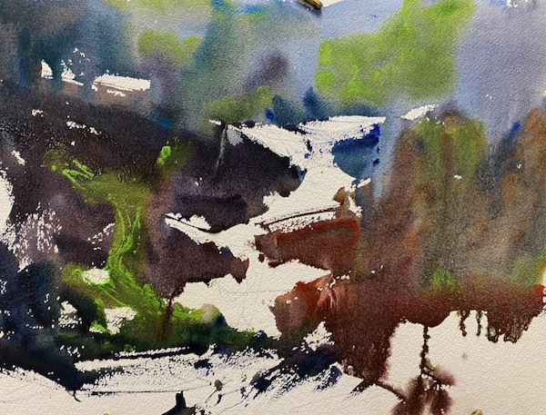
As I worked down to the bottom, I added a lot more texture to bring the shapes forward. Things in the front of a painting should have more texture, color, and detail. The background is fairly soft and cool. Notice also that the white shapes are very angled, and they have movement, none of the shape are flat, they all have a diagonal feeling. This gives the shapes power and movement.
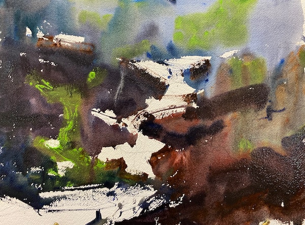
The paint is still wet but is losing its’ glisten, so I scrape the top edge of the rocks, using one stroke at a time, not multiple over-lapping scrapes. Since I used such rich color for these areas, the colors I was using like burnt sienna show up in the scraped areas. I painted in the cool shadow areas on the water using cobalt blue and a little neutral tint, to give the white shapes even more visual interest. This is a small thing, but it is hugely important. I over painted the background trees with some darker washes to give this area more form.
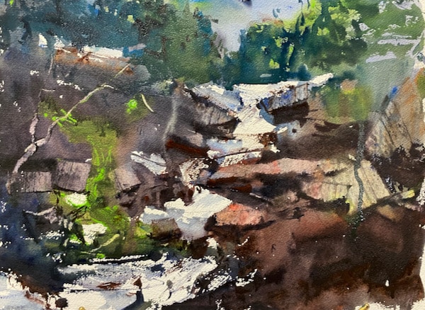
I added a few details but watched that I didn’t get too fuzzy. Start your painting fast and then slow down at the end, many good attempts are ruined with too much manic painting at the end of the process. Think about your marks, think about your adjustments.
Image final