As with the last post, this blog entry will discuss adjusting the elements of the photograph to make a more interesting composition. Unless we are great photographers who happen to have the discipline to wait for the right light at the right time of the day, we are usually taking pictures that are just snapshots of places that need a little composing to make good paintings. Remember you can always move major shapes, leave out unnecessary information, change the proportions, the direction of the light, or point of view. This takes practice but it is worth it.
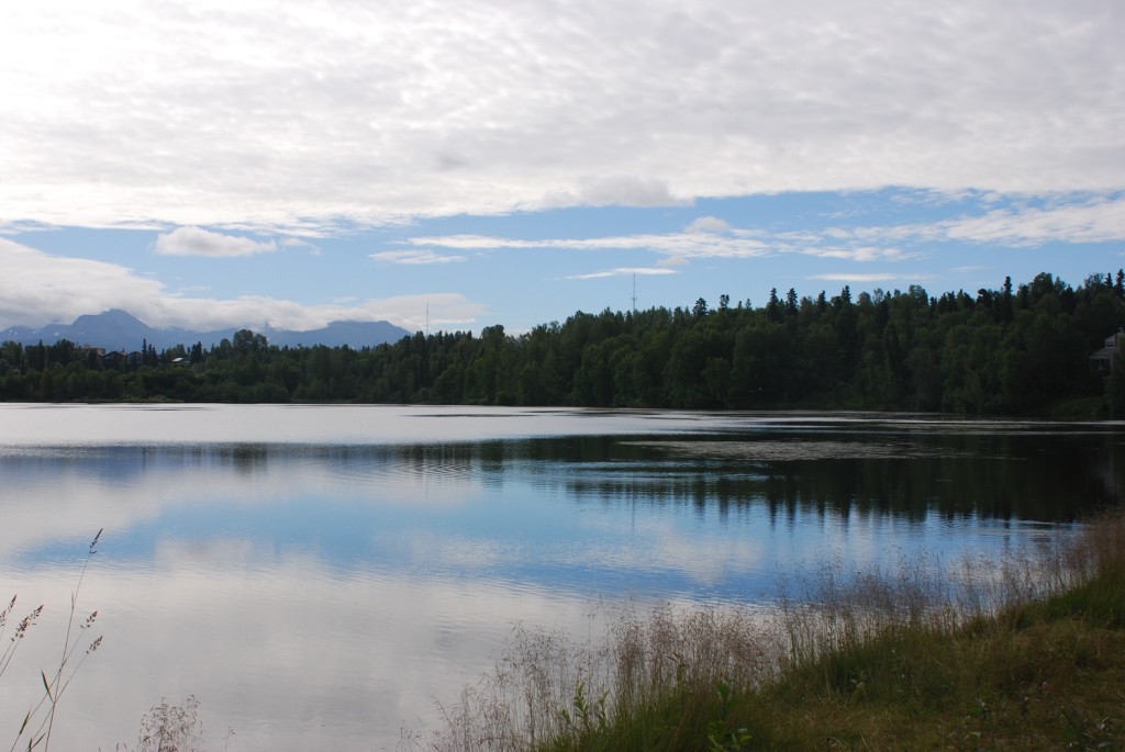
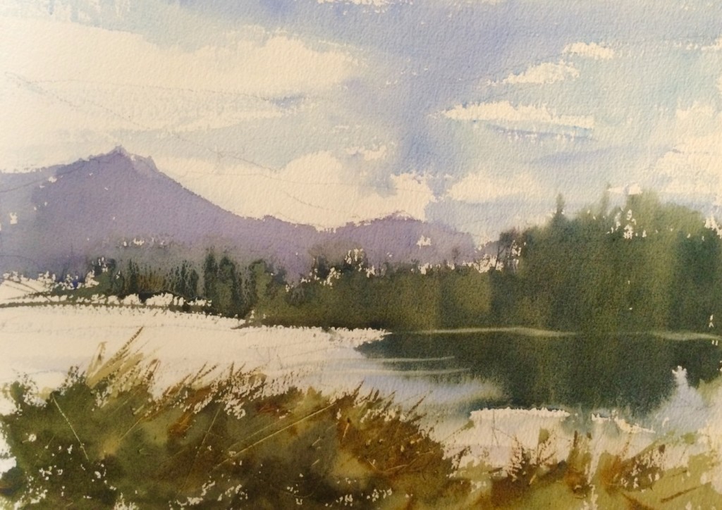 In this demonstration painting I brought the background mountains into the center of painting and made them much larger. I also made the foreground weeds overlap the composition and made them interesting with the brush work and color. I put the weeds on the left and continued them all across the bottom which the center of interest more focused. If I would have painted the image exactly as it is then the painting would have been just a panoramic copy and I think it has more focus the way I painted it.
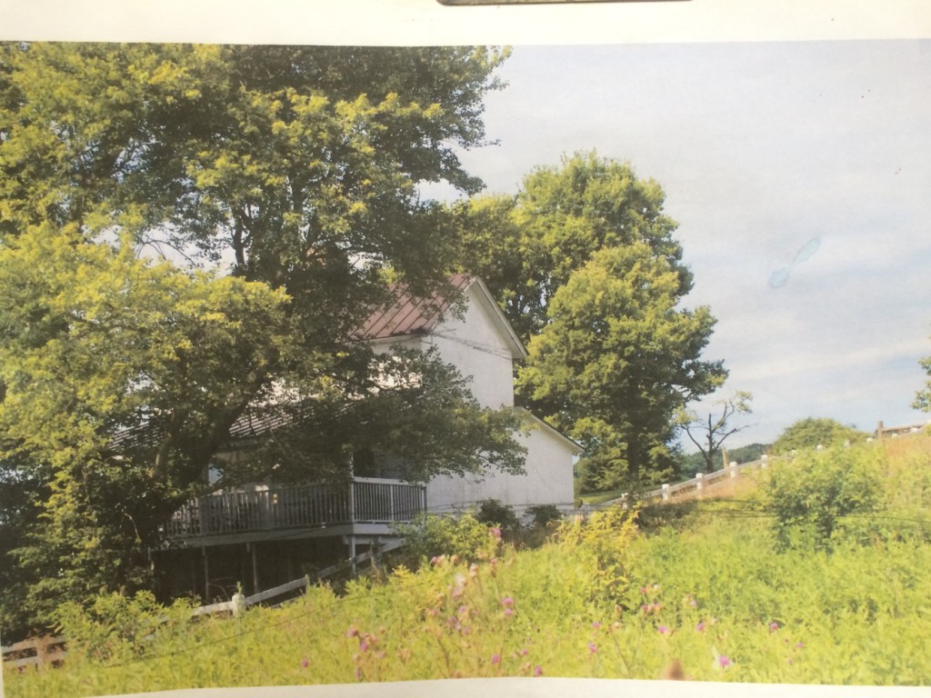
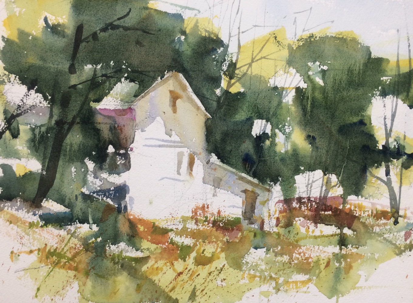
 In this demonstration, I changed the light to be on the front of the building. In the image the light is on the side of the house behind the trees on the left and this is a very small uninteresting place for the lightest light of the composition. I also decided to make the foreground more abstract and expressive. The white paper I left in the front amplifies the white on the house and white in the trees. Try to use the white paper as interesting shapes in your painting not just random areas of white. Use the white shapes to enliven your painting and move the viewer through the composition.

I will definitely experiment with white shapes. Studying your foregrounds are always helpful. A couple of years ago I took notes on a few of your videos re color choices. I have since lost them. Do you mix all your greens, I think you did in the videos I watched, or do you use “convenience” colors as well. As always thanks for the great instruction.
Nanine
Llevo tiempo siguiéndole y me parecen muy interesantes sus indicaciones para sacar todo el partido posible a las fotografías sobre las que trabajamos. Llevo tiempo planteándome cómo sintetizar mis trabajos y su estilo me atrae grandemente.
Hi Steve. Magnificent lesson about editing the photography and the composition of the scene focussing the focal point, along with the reminder about to make interesting white shapes with the aim of boosting the scene and move the viewer across it. Thank you so much for sharing. With respect, Mercedes
A long time ago now I took a watercolor class from you at the Lyon Park community center in Arlington. Do you happen to remember when you taught there? I’m trying to remember how long I’ve been painting – and that was my first class. I have a lousy sense of time. I switched to acrylics and abstracts, but have been painting ever since. Thanks for being encouraging and funny and getting me started.