In this lesson I will be showing you how I approach using opaque watercolor, which is handled fairly similar to oils. I start by establishing the major dark shapes and the middle value shapes and then the light values. I work a little darker than I want the finish so I can put in highlights and half tone values on the darker shapes to create more interest and form. Also I use less water than I do in transparent watercolor. I hope you enjoy it.
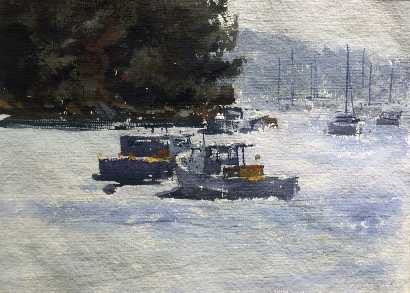
 Here is the finished painting and it is painted on the handmade Savoir Faire paper I use quite a lot. The paints I am using are mostly Holbein Gouache if that is not the right spelling I am sorry and Silver Brush Company black velvet rounds.
 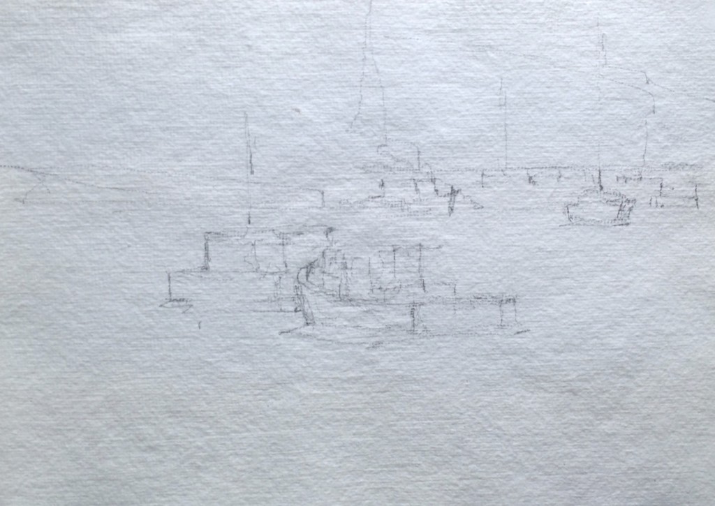 Here’s the drawing which is a departure from oils since I really don’t draw when painting oils.
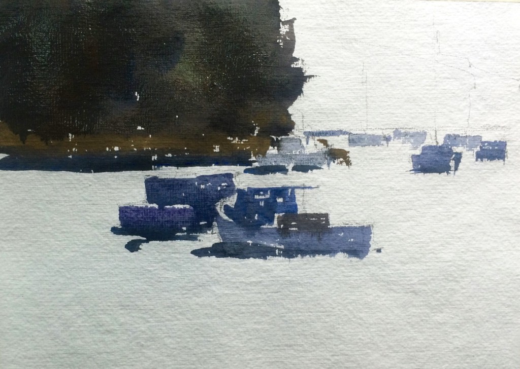 I establish the darks and middle values leaving areas that are light as just pure white paper. I try at this point to really focus on attaching the shapes and keeping the values approximately correct.
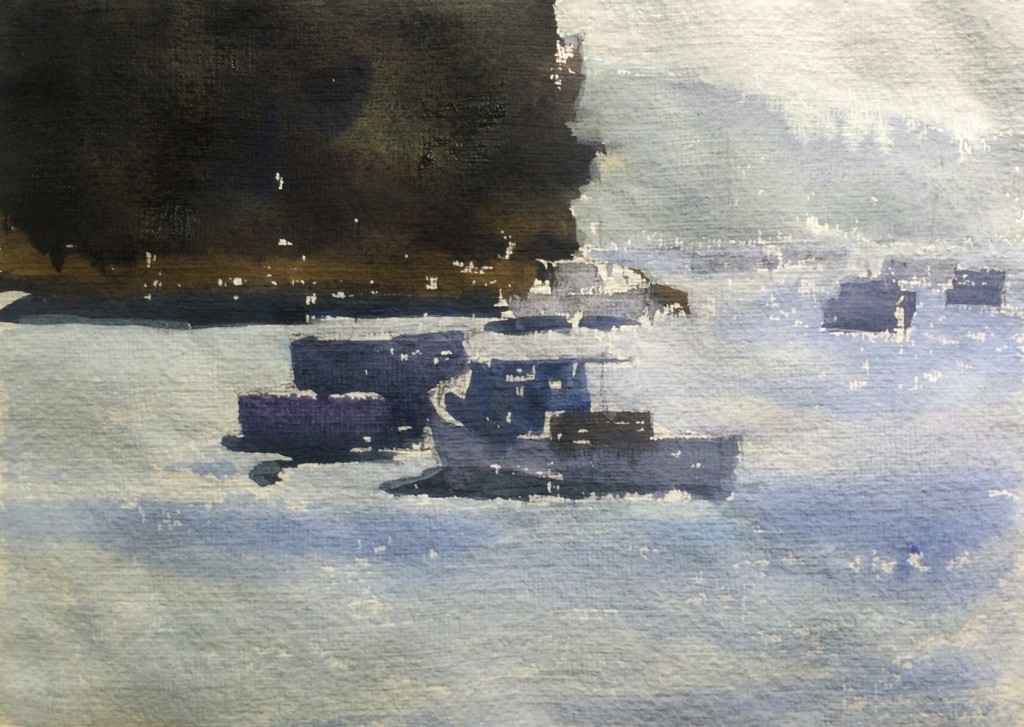 I paint in the lightest values, again I am using white paint to lighten the colors so I am not using lots of water. One reason that opaque watercolors are fun is that they allow you to get more density in your lights. I find this exciting.
 I put in accents and lightest values and add some light middle values to the darks to get more of a feeling of form. I like the process with Opaque watercolors and use this medium a lot outdoors because it is similar in finish to oils and I can work fast to capture the scene, clean up and be gone.
Hi Steve. I am following with great interest your new challenge for this year, opaque watercolor. While you had already posted something of this in the past, now it seems you retakes seriously and concurrently this issue. However, I hope to see more transparent watercolors yours because I love your work in that media. But what I appreciate most about you is your didactic teacher. No matter what media you use, we always learn something. Thanks and Happy 2016