Well my blog has been fixed by my wonderful friend Christine and I sure am happy I know her. Thank you so much.
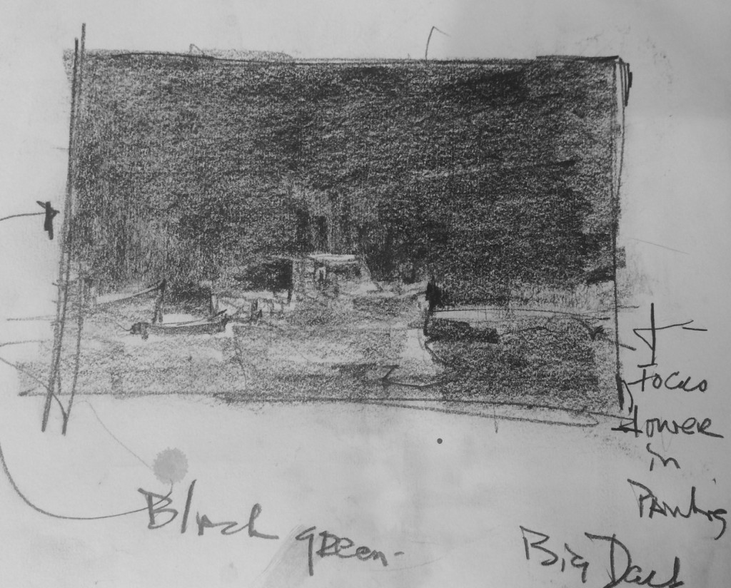
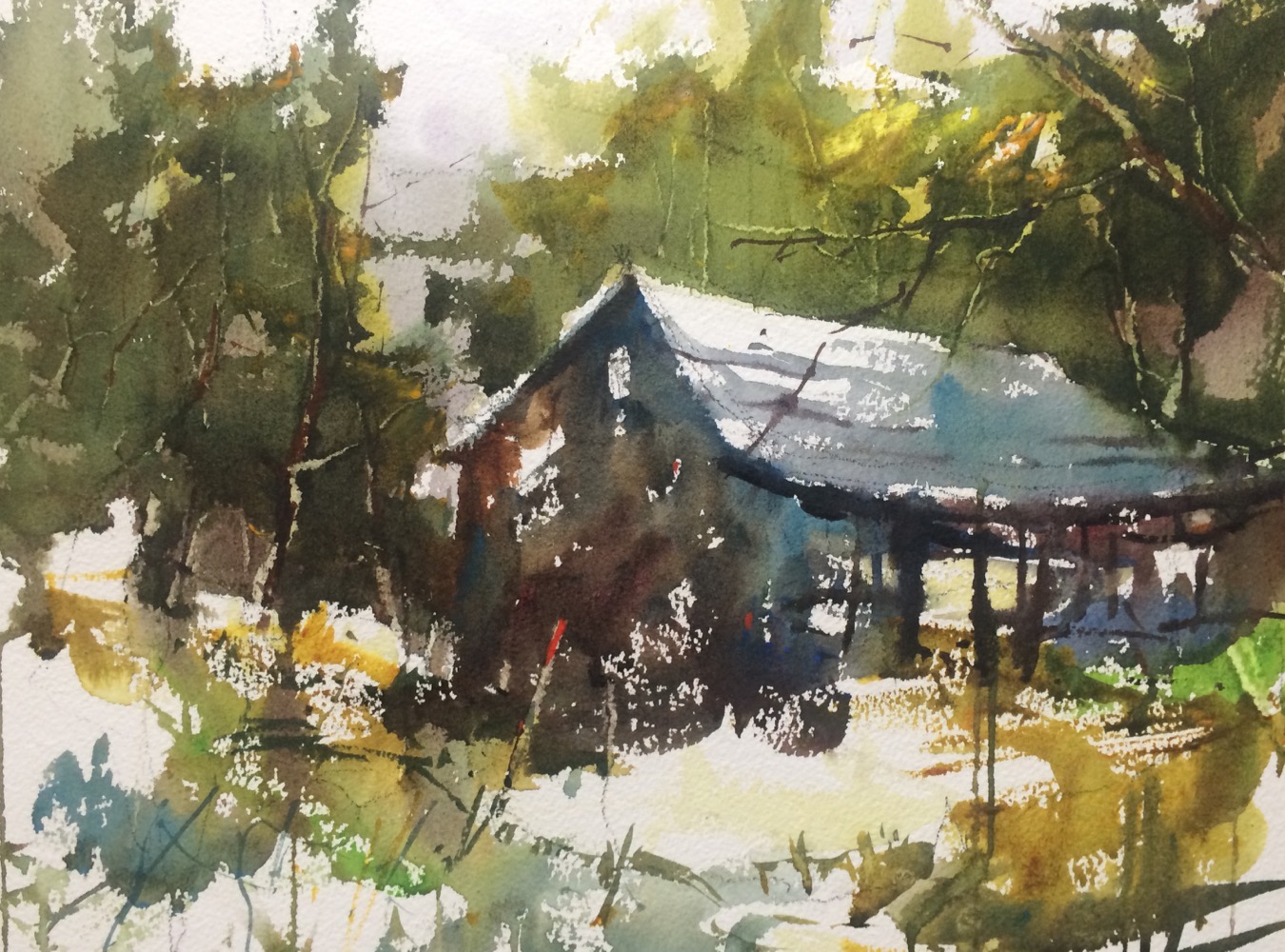
Here are a couple of demonstrations from my classes this week with the value patterns that I use for the painting.  16 x 20 watercolor on 300 lb paper. I was focusing on changing the image to improve the composition. It is important that you look at your photograph and create a better composition and put your intention and personality into the painting. I used a black and white value pattern to create movement and a center of interest which was missing from the photograph.
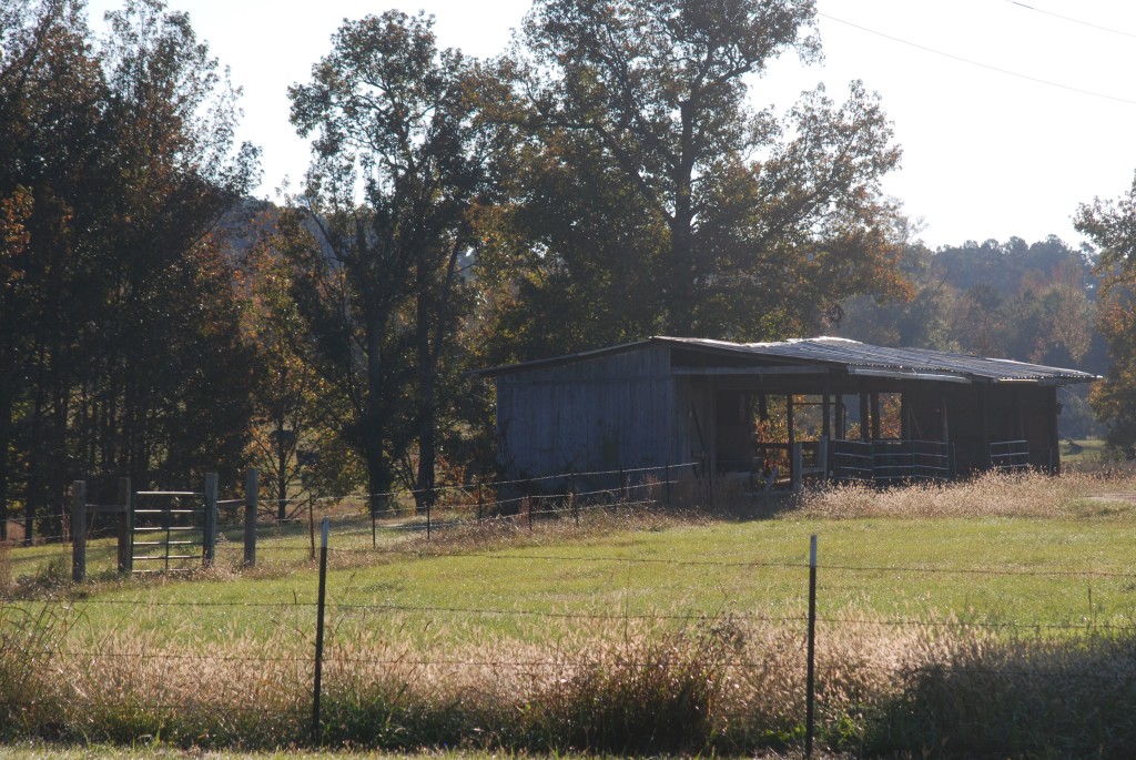
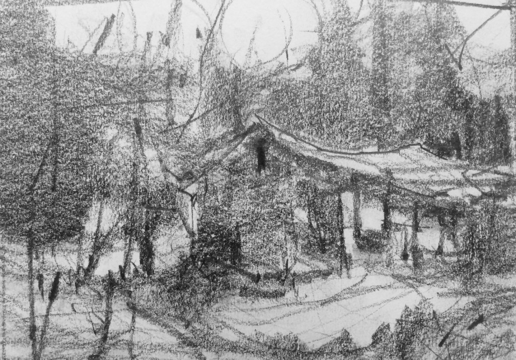
This is the value pattern that I used for the demonstration, I went through the process of selecting a center of interest, and the photo have multiple options for a focus center. But I reduced the front grass and moved the building to the left. I think it is a fun and exciting painting
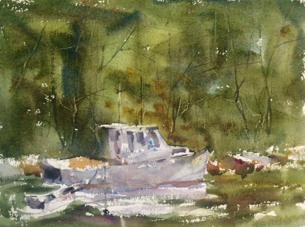 This simple composition has well conceived small white shape in a large dark middle value area. I was working on demonstrating large value masses and big to small relationships.

Hey Steve! I recognize that barn, but must admit that I have never seen a painting in it until you did this. 🙂 Love the boat too! I’ve posted it to my Pinterest page under blogs and Tweeted it too! Look forward to seeing you next spring.
beautiful! now if you could only do a few more videos…
I am soooooo happy to get u up & running! xoxox
Steve…there is a tiny red paint spot at the top of a pole in the barn photo–this looks like something I would do! In fact yesterday in class you asked me why I did it on my little oil painting 🙂 Why did you do this?
what a great surprise to see your blog posts once again-they were missed-thanks for posting the photo referance along with the painting-like how you changed the viewpoint of the barn-the painting really works
what a great surprise to see your blog posts once again – thanks for posting the photo referance along with the painting and the value pattern – I learn about how you changed the viewpoint of the building – I like very much your finished paintings.
what a great surprise to see your blog posts once again – thanks for posting the photo referance along with the painting and the value pattern – I learn about how you changed the viewpoint of the building – I like very much your finished paintings.
Thanks for the comments, the red dot on the pole was to seperate it from the background and create a little contrast it probably should be repeated somewhere else. I did copy it from you Colleen. I am happy to have the blog back up too. I missed it as much as you all did. Thanks Dot for posting my page, you are wonderful.