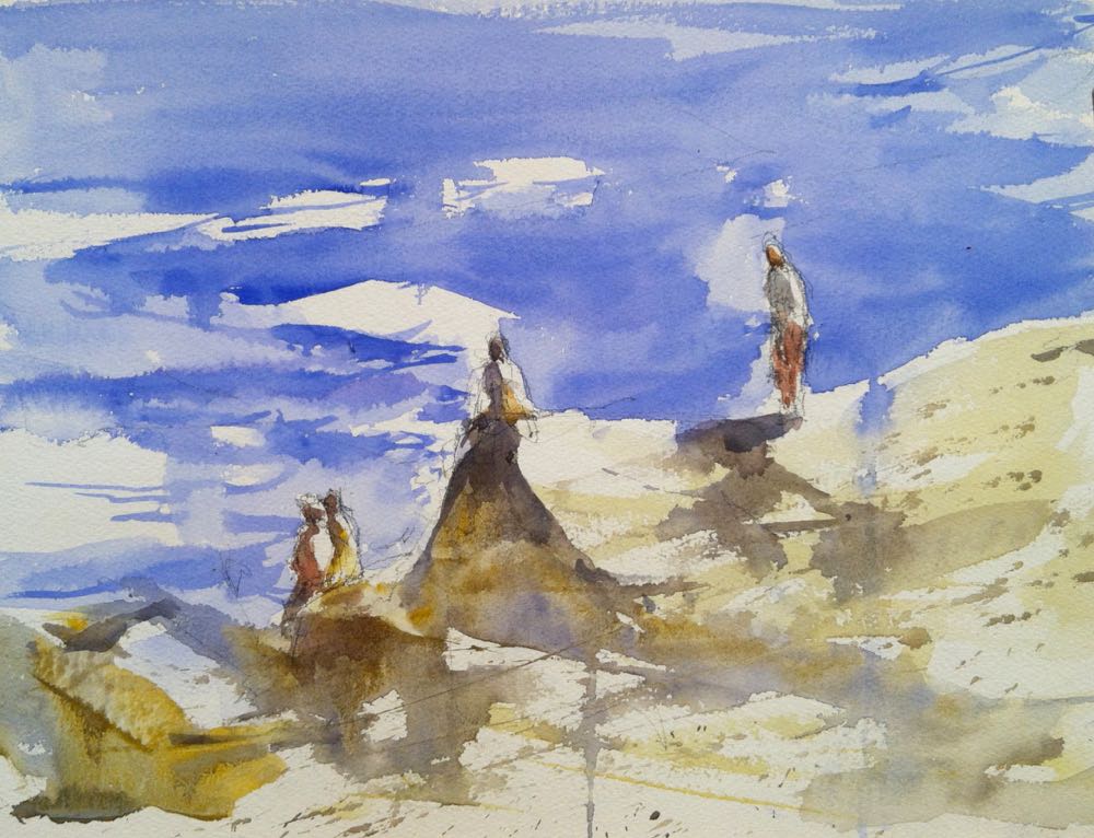
These three watercolor paintings have the same theme, strong light, and I think they work to support that simple concept. My watercolors will have a better chance of being successful if I define before I start the main theme and the strong value contrast I will use. I do this with a value pattern before I start. If you want and explanation of this look up my lessons under the tab lessons and videos and scroll to table of contents you will find a lesson on value pattern. In each of these paintings I made sure that I had the light defined in the first step of the painting by leaving crisp white paper and painted my darkest values against the white. In the painting of the roof, the center of interest is the small shadow on the roof, this simple detail defines the light and makes the white piece interesting.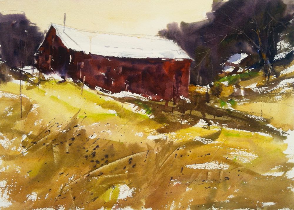 In this next painting I used the white pieces of waves to accent against the figures on top of the rocks.
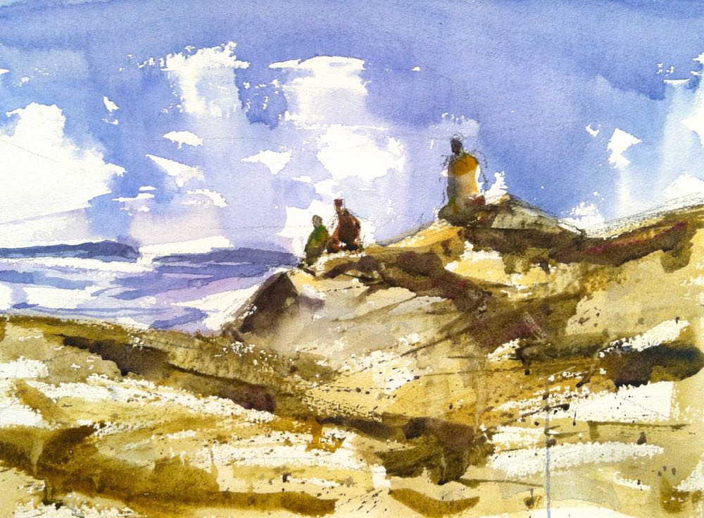
 In this last painting I made the figures and the shadows a darker form to plays against the lights in the sky. This give the very similar subject matter a feeling of a different time of day. Remember controlling the light in your painting will give it a better feeling of time and type of day.
1 Comments on “In The Studio: Three Class Demos from Thursday”
Leave a Reply Cancel reply
This site uses Akismet to reduce spam. Learn how your comment data is processed.

Thank you for the magnificent lessons in three watercolours. Super sense of direction of light