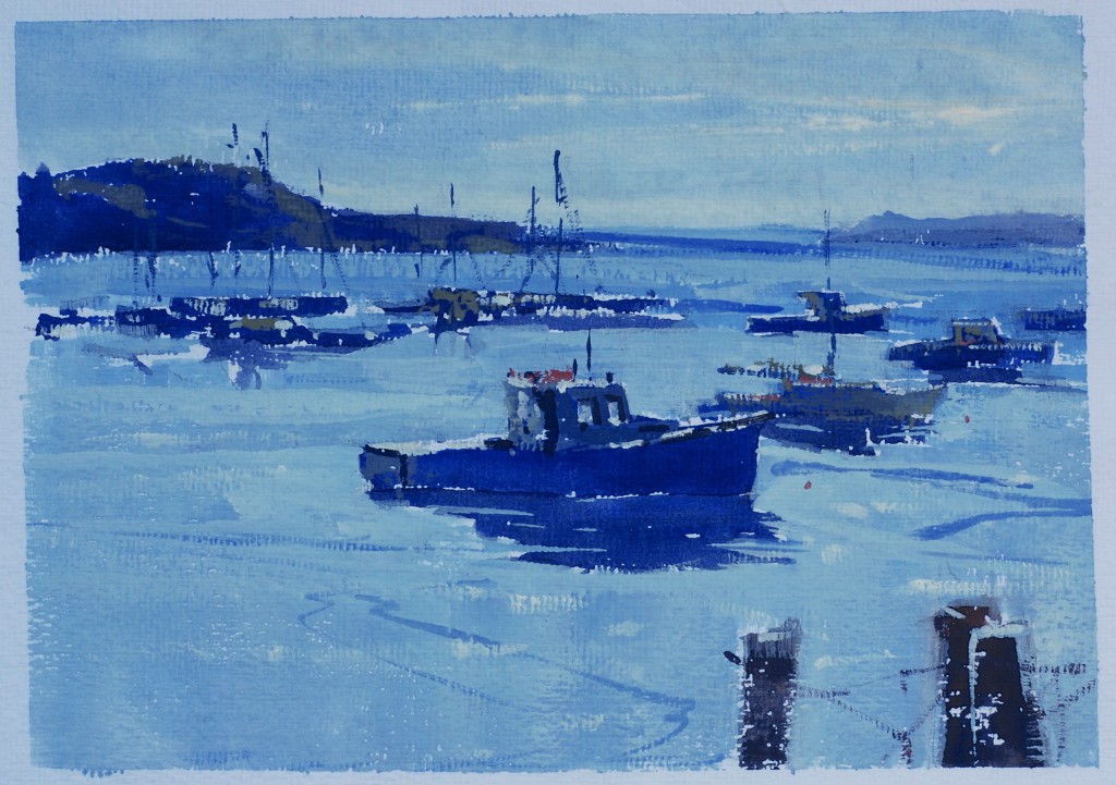
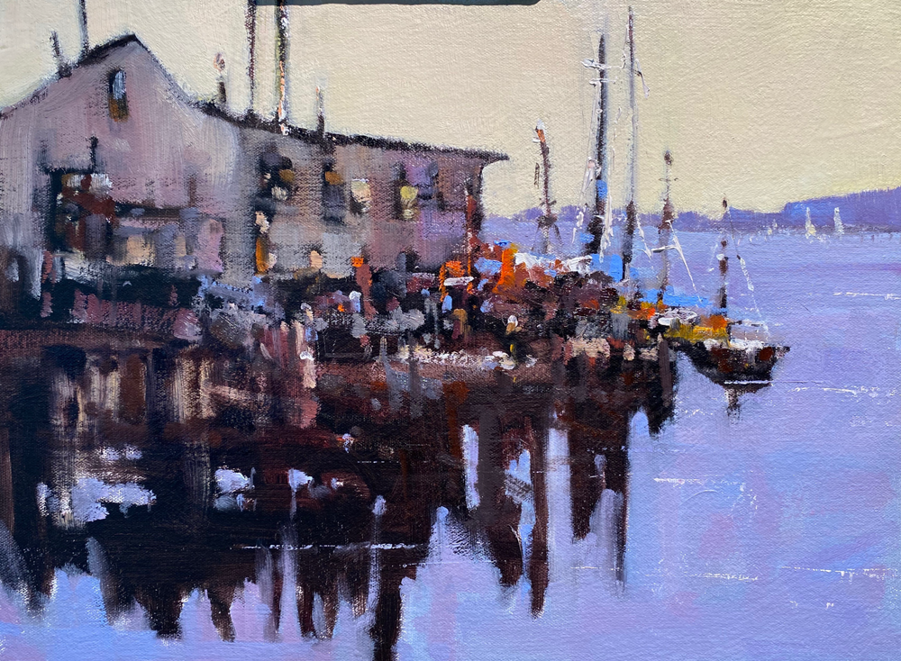
Here is another fairly simple composition, in which I am trying to capture the backlighting effect of the late afternoon in Rockport harbor. The thing I am finding about the opaque color is that I can get the light middle values to have the density of the color of light better than I can with transparent watercolor. Remember start with your darks, use less water, come back over your dark shapes with lighter values, and really use opaque color for the whites. Very little water or else you get very chalky and diluted whites.
1 Comments on “In The Studio: Opaque Watercolor: “Afternoon Calm””
Leave a Reply Cancel reply
This site uses Akismet to reduce spam. Learn how your comment data is processed.


In this watercolor (wonderful), you’ve got an extraordinary glare, despite being opaque pigment. It is evident that the brightness is not the white paper through the transparency of the color. According with your previous classes, you have got much of the scintillation by saving small pieces of white paper, but, could you tell us what blue color have you used?. Thanks a lot. Respectfully, Mercedes