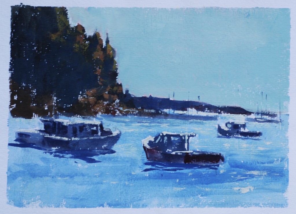
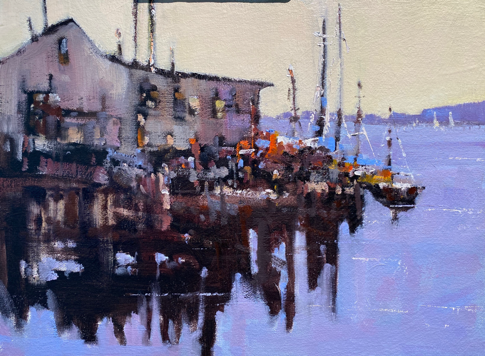
With opaque watercolor like oils you start with the darks shapes, work through the middle values, adjust the colors, in the darks and the middle values, and then use the whites, or lights to clarify the shapes, add focus, and time of day or type of atmosphere. I like this approach to these paintings. One thing I will say at this moment, is that you should use less water than you are used to with transparent watercolor, let the colors hold their own as a value statement and work towards a thick rich application of lights. Too much water dilution and the colors become murky.
2 Comments on “In The Studio: Opaque Watercolor “Rockport Glimmer””
Leave a Reply Cancel reply
This site uses Akismet to reduce spam. Learn how your comment data is processed.


Here is a great lesson about how to start with the opaque watercolor. A million thanks, Steve. I try to grow in this challenge with you. Respectfully, Mercedes
I am continually in awe of the ways you are able to bend and stretch.