I am headed to Maine in a few days to teach my 2 week workshop and it has been a whirlwind getting ready for a workshop that is going to focus on both watercolors and oils. Each day I will demonstrate both mediums it will be fantastic but it requires a lot of preparation on my part. Wish me luck. I have a lesson here on making value patterns and in a few days I will be posted a lesson on simplifying the subject. I hope you find this informative.
Value Patterns
When organizing your painting it is important that you spend some time before painting thinking about the arrangement of the lights, darks and midtones in you painting. This planning stage will give you a better chance of painting a focused and entertaining painting. Due to watercolors’ unforgiving nature it is important that we do not begin to paint without some understanding of where we are going . It is much easier to change the value pattern than to change the painting once we are putting paint on paper. Most good artists do not overlook the planning stage and it is the fastest and most effective way to move past strictly replicating photographs.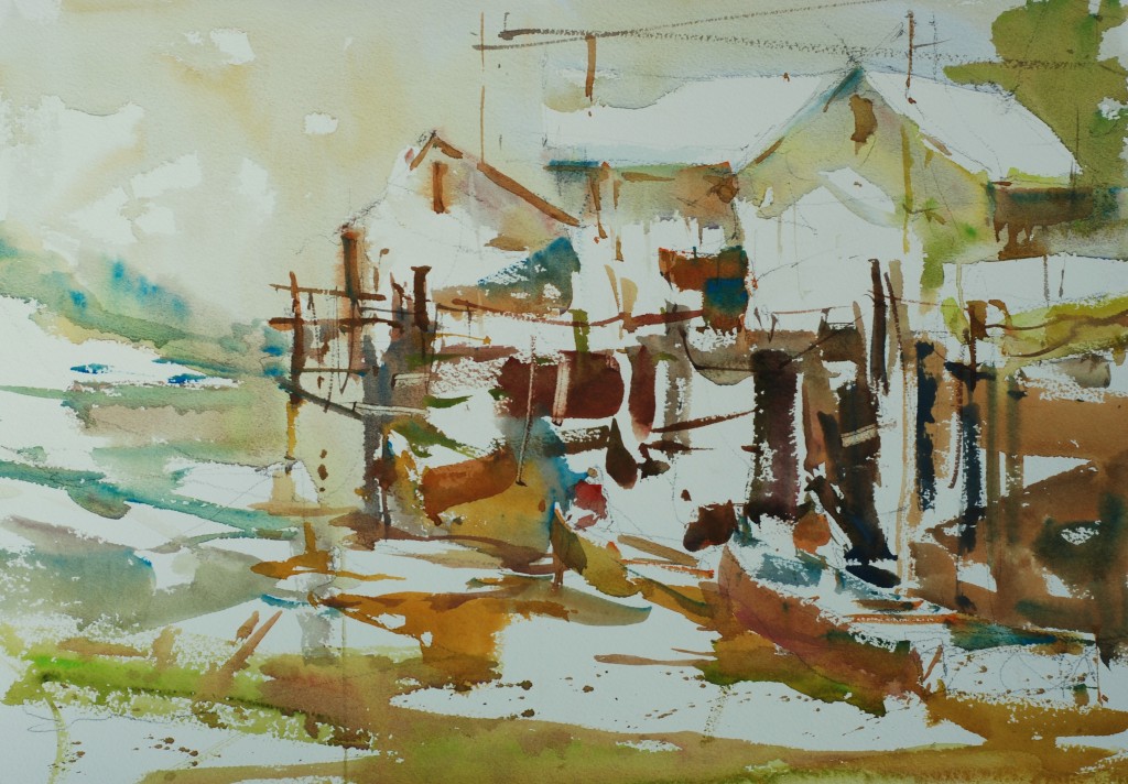
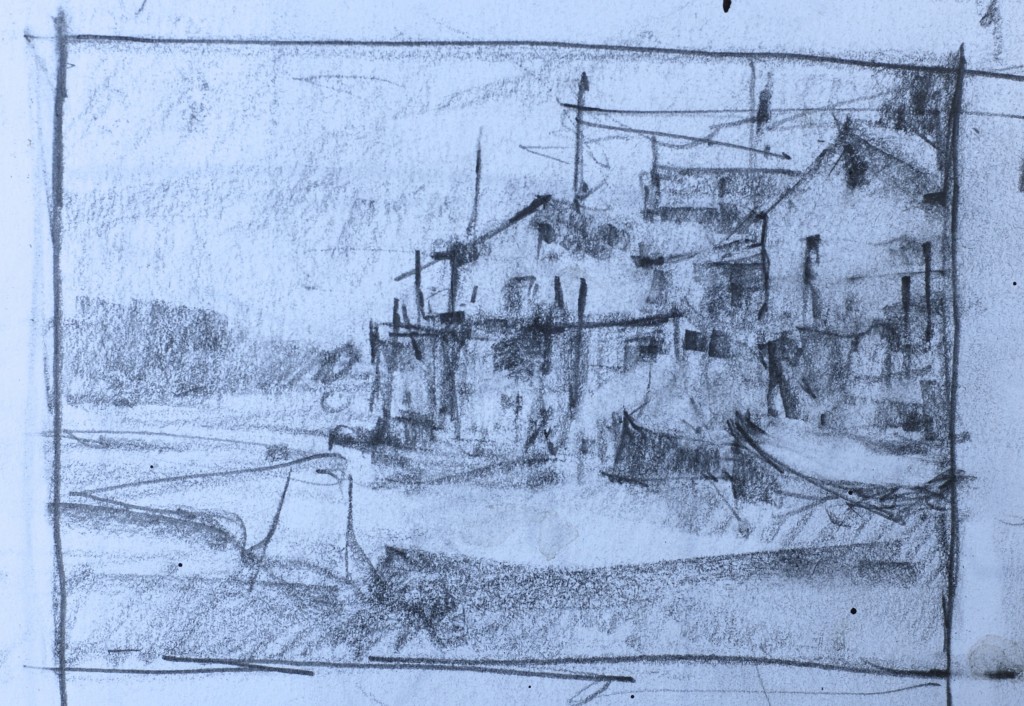
When we talk about values in painting we are discussing the lightness or darkness of the pigment when it is applied to the paper. Paint straight from the tube without any water added is the darkest the pigment will read on the paper. Of course we can darken the paint further by adding black, or a complementary color or by moving towards purple on the color wheel. By adding water to the pigment we can lighten the pigment. The more water the lighter the wash of color. Each pigment has a dark range so try not to be confused by the more light reflective colors like yellow because they too have a very dark characteristic if they are applied straight from the tube.
When we begin to put together our value patterns we should start with a drawn format box that has a shape and dimension that comes close to the actual paper we are using. Without the format box it is really hard to get the feel for the placement of the value shape on the paper. For full sheet, half sheet, and quarter sheet paintings, I use a box approximately 3.5 to 5 as a relationship. This will work either horizontally and vertically. Remember if you move to a different painting shape you change the format shape of the value pattern.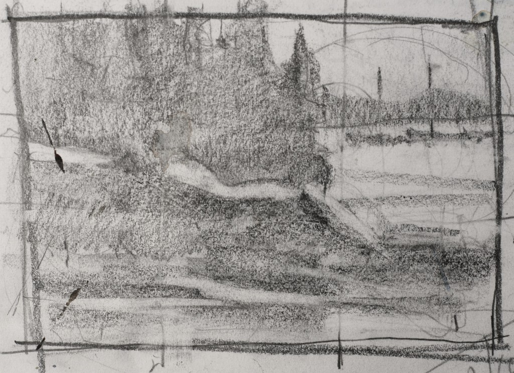
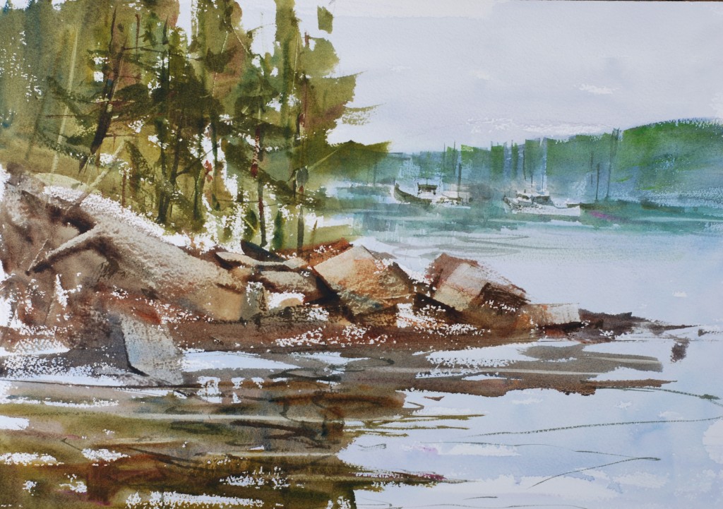
First I must emphasize that a value pattern is not a drawing or a finished sketch. It is simply an organization of the lights, darks and midtones of the planned painting. The major shapes of the painting are put in but details are kept to a minimum. It is a good idea to put notes on the outside of the value pattern which give you direction in the area of graded washes, dominant elements, and contrast areas. You can also circle areas in the value pattern and show drawing details outside on the border. If for example you had a specific boat or group of figures you wanted to use you would draw them as a detail outside the value pattern with an arrow to its’ placement on the painting. All of this pre-planning gives you a familiarity with the subject matter that will improve your understanding of this paintings’ agenda. It will also help you to understand the sequence of paint application you will use. Another wonderful benefit of a well thought out value pattern is that when finished you understand the paintings’ structure better and can approach your work with a more creative and expressive attitude.
Begin the value pattern by drawing the format box in your sketch book not on your watercolor paper. Then look at the reference sketch, photograph, or nature scene and put all the values into only three categories. The lights will be everything that is the lightest values your are looking at, but they are not exclusively white objects. An objects local color does not matter in its’ lightness or darkness. Depending on the mood, time of day, or effect you are trying to create the lights can be any value as long as it is lighter than the midtones and darks. Just before sunset when the light levels are very low the lightest value you will want can be a middle value and in this situation their will be no traditional light value. Normally the midtones are the values that fall in the middle of the value scale again remember that these will be relative to the desired effect or lightness or darkness of the source material. The darks are the darkest objects in the painting. For designing purposes, you should merge your values into only three ranges. This helps to clarify the value arrangement, and simplify the designing process. Once the painting begins the nuances of value will interpreted within the value pattern, but the goal is to keep the integrity of the pattern. At this point in the process color is not the major consideration remember that each color has a complete range of value. Keep your concerns to the relative value of the major shapes and choose your colors later.
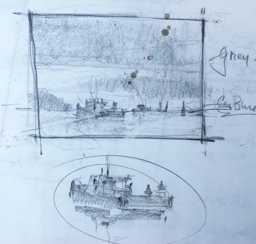
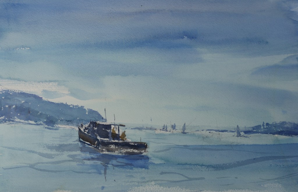
Using a soft pencil cover all areas of the format box that are going to be the midtones leaving the lights as white paper. Remember to leave the white paper or white area as a well placed, well designed shape. It is at this point that you begin to think in terms of the quality of the shapes of your painting. Does each major shape conform to the definition of a good shape. After you cut around the white paper you must consider the placement of the dark areas. As a good starting point you should make sure that the majority of your lights and darks are in close proximity where the center of interest in you painting is going to be. Again the dark shape needs to be analyzed for its quality as a shape or shapes. A key element in the arrangement of values in the painting is that all of the three values should be unequal in size. I think to begin with it is best for you to keep the midtones the greatest portion of the painting with the lights and darks splitting the remaining portions of the painting into unequal pieces. Make sure that you assign each shape in the value pattern a value. This is important because areas that are not resolved now will definitely be a problem later.
After you have made the value pattern you can look at it to see if it reads well and has a good design. Are the major shapes interesting? A good shape has a different dimension in length and width, has movement, has a variety of edges, is attached to the surrounding shapes in the painting and has a slight gradation of color or value from one edge to the next. Is the center of interest in a good location? Is the movement of the painting headed where you want the viewer to look? Does the space division complement your paintings intention? Are the value areas too equal in size, shape, and direction? Is the center of interest where most of the main activity of the painting is going to happen? Is the value arrangement appropriate for the mood, time of day or type lighting you are looking for? This type of analysis of the value pattern will give you the needed feedback for design modifications. If you need to make changes then go ahead. It is easy to make the changes now and not so easy once the paper is wet and the paint is flowing.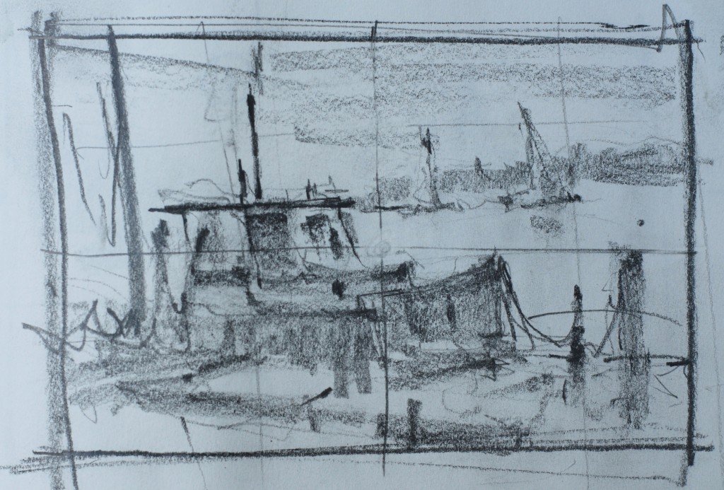
Once you get comfortable with using value patterns you can begin to design paintings based on what you want to paint not what you see. By learning to reverse the values of the major shapes and changing their proportions you can create works of artistic expression and free yourself from the total dependence on the scene you are looking at. You can change the mood or feeling of your painting by adjusting the values of the major shapes in the painting. The process of learning to invent and rearrange value patterns will take some work and initial struggle but the rewards will be fantastic. Soon you will be inventing your own shapes, taking more chances and creating better and more satisfying works. Although the process seems like it will create overly tight paintings in fact the opposite is true. By having a familiarity with the subject and a solid plan for the painting you can approach the painting with a more loose and free attitude.
When you are happy with the value pattern sketch the major shapes on your watercolor paper. Do not shade in the values on the paper or the graphite from your pencil will dirty your washes. It is a great help to mark the middle of your value pattern with a cross and make the same cross on your watercolor paper. This will help you align your drawing correctly. At this point you should use your source material to put in the amount of detail you are comfortable with. Try not to overdraw your painting, leave some things loosely indicated, and let the finish come to you as you are painting. Set your value pattern where you can see it when painting. It doesn’t make sense to create a terrific road map and then totally ignore it once you start on your journey. When I paint I rarely look at photos once I start. I look at photos only for reference when dealing with complicated subject matter, interesting local features, or specific placement of figures. I turn the photo over and I make all of my creative decisions based on the evolving painting and the value pattern. I look for areas to contrast colors, darken or lighten value chords, improve a shape, create texture, soften or harden an edge. These decisions are determined by the painting not the photograph or the source material.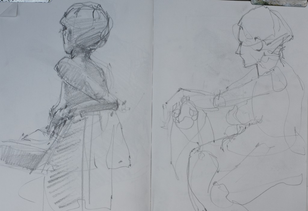
I have always used this method when painting. It has served me well over the years. Although a lot of my paintings do not turn out even with the use of a value pattern to paint from, my successes are much more frequent than on those rare occasions that I choose to proceed without one. Designing the painting will engage your brain, your memory, and your artistic talents. Give it a go.
Exercises
Do several different value arrangements of same photo or sketch.
Take several failed paintings and correct the values by making a new value pattern and re paint
Change the mood or time of day of photo or source material
Make several value patterns a day.
Show two illustrations of the process with notes.
Analyze two illustrations for their worth and make changes.
Show value range in black and white and several colors
Reverse the values in several value patterns
Explain relative lightness sunset, and backlit white subject


There is a wealth of information here! Many thanks for creating and posting this here and on your blog.
Steve,
Thank you so much for the time and effort you took to prepare this valuable Information for us.
Still much to learn, I guess.
My best,
Enid
Thanks for the new examples that you have added to your repost lesson. They are very instructive. I´m glad to hear from you again. Respectfully
Steve-thank you for taking the time to share your knowledge-I look forward to your posts and always learn something from them-have fun with your workshop-I work in both oil and water color and your Maine workshop is on my bucket list–someday……