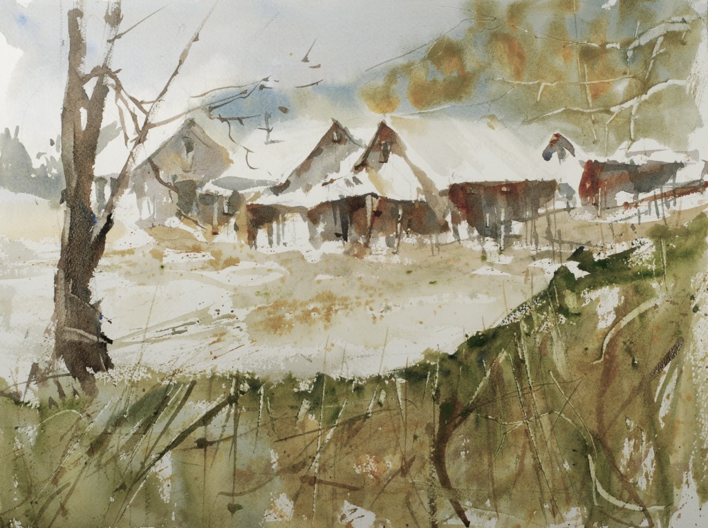
 Today’s piece is a study in using greyed colors against pieces of white paper to achieve an interesting painting with a very limited palette. Usually when working in limited palettes the colors become very predictable and boring because the painter hasn’t given enough thought to embellishing the color shapes with a variety of mixes, expressive texture and brushwork, and nice open shapes. Open shapes have a connection to the shapes around them with either color, or value.
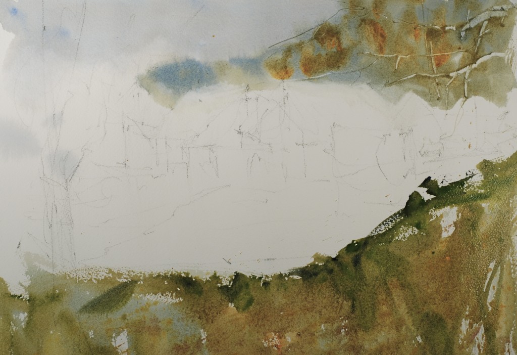 Paint the sky background trees and foreground while the paper is damp. For the sky I used cobalt blue, burnt sienna, ultramarine blue and hints of orange. The trees were the same blue mixture of the sky with some stronger pieces of cool grey warm grey and then I dropped in some olive green. The foreground is exactly the same colors but the are applied much stronger and with a real strong focus on varying the colors.
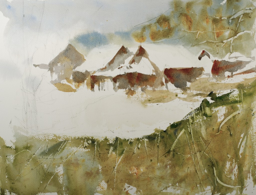 Paint the building in one continuous passage of color starting with a nice cool grey, ultramarine blue and burnt sienna, and add stronger pieces of burnt sienna and hints of raw sienna. Don’t get fussy with details and scrape the weeds while they are still damp. I used a sharp pointed pocket knife, courtesy of my friend Dell.
 Paint the tree with the same grey we have been using and paint some details for the weeds, think rhythm in the brush marks. I used a middle sized rigger number 6. Put in accents on the buildings, windows, doors, eaves, keep them light.
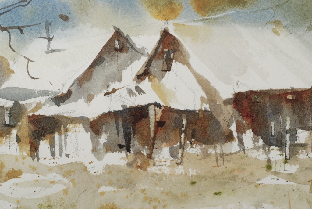 Detail of the prominent piece of the buildings, notice the scrapes and dark accents. Keep all of these embellishments loose.
2 Comments on “In The Studio: Repost “Winter Gray””
Leave a Reply Cancel reply
This site uses Akismet to reduce spam. Learn how your comment data is processed.
So glad you reposted this-it’s very helpful for those of us who have been struggling with designing good shapes in a value pattern. Love the limited palette!
Important lesson that I’m already practicing. Thank Steeve. A warm greeting