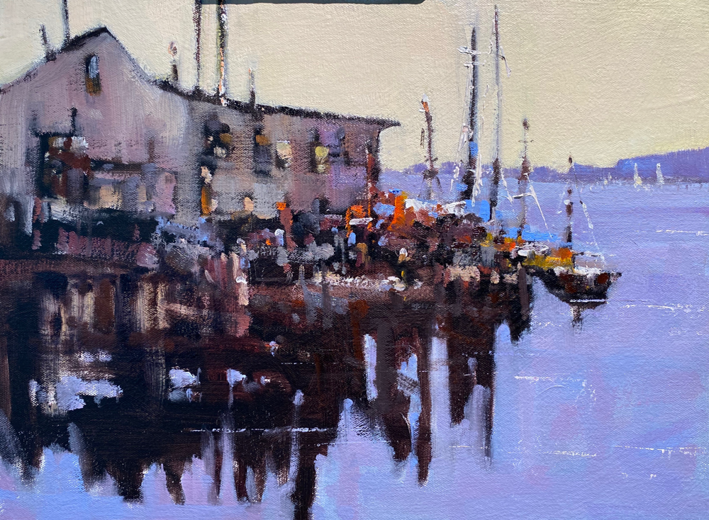
Today I will post the next installment of the using white shapes and paper to focus your paintings, I hope you enjoyed the first part.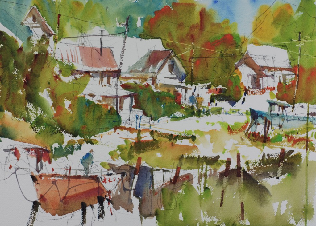 I created a passage of white paper and moved it from the bottom of the paper and worked all of the way up to the top. I used a lot of interesting little shapes and colors to make the passage through the painting interesting and slow. This was a complete invention on my part the scene Camden Harbor was not anything like the finished painting. You have to use your creative brain to pull this off.
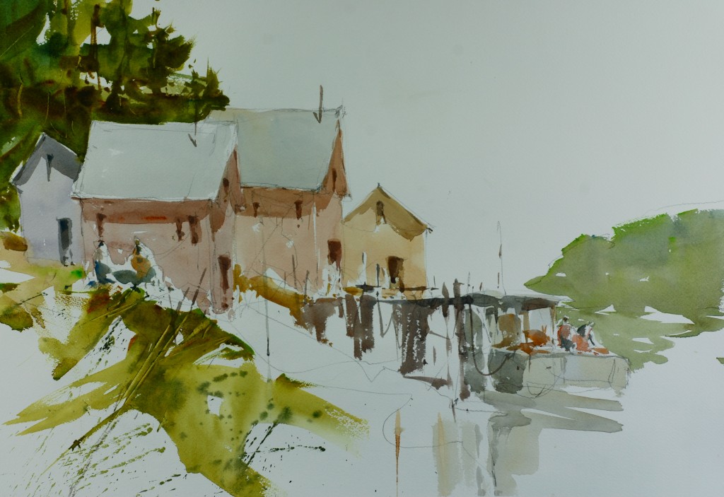 In this painting I minimized the foreground details and used negative shapes of white paper to make it more interesting. I played the top edges of the buildings and dock against white paper and I feel it gave the painting a really crisp and focused feeling. Don’t be afraid of leaving white paper just for effect.
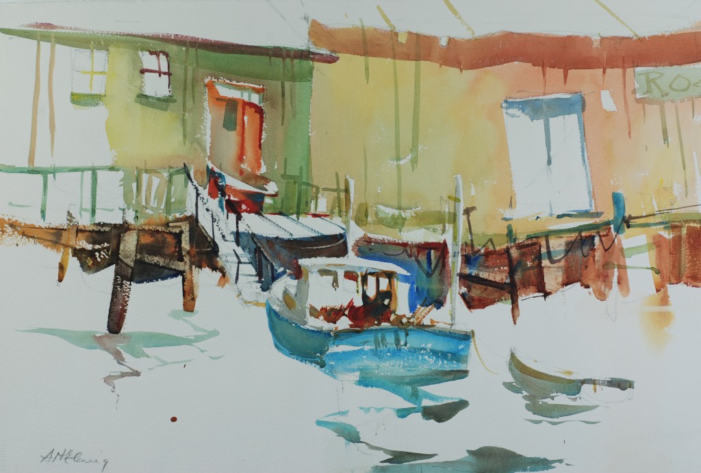 In this painting I basically used white paper to wrap around all of the color forms. Again this has focused the painting into the middle. I worked some white accents into the darker color mass and this helps create a feeling of harmony in the painting, everything fits.
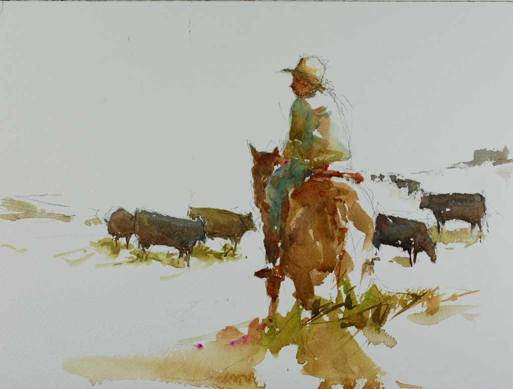 My cowboy painting again but it is a great example of creating a painting by using white paper to focus the colors. I love the way the colors that I have chosen to use work against the white paper and give just enough descriptive information to tell the story but not too much information. Let the viewer participate in your paintings.
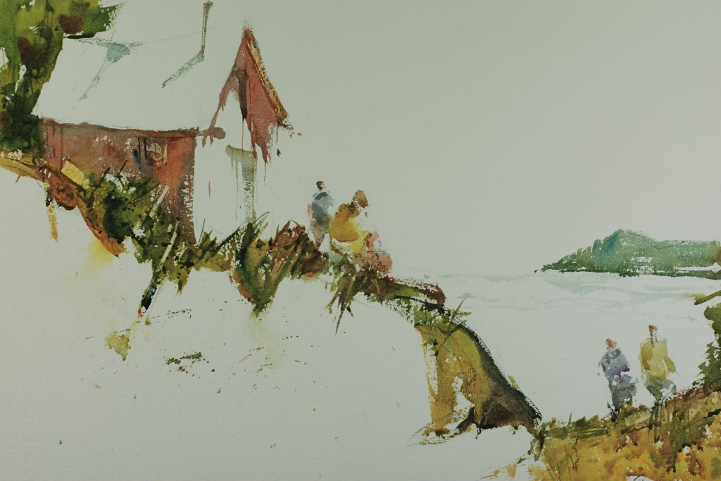 Just enough information and lots of white paper, that will do it for this lesson.
2 Comments on “In The Studio: Creative Use of White Space Part 2”
Leave a Reply Cancel reply
This site uses Akismet to reduce spam. Learn how your comment data is processed.
So beautiful! I enjoy the white. Gabi
Masterful lessons about the white forms use to work to our advantage and make them participate as characters in our story. Now I have to try to do it without make it too obvious and artificial.Thank Steeve, I enjoyed reading both lessons and admire your good work.