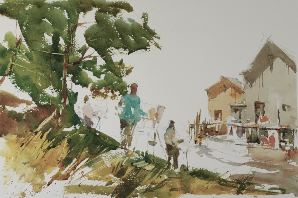
In today’s post, I am putting up my most recent demonstrations from my classes at the Art League. Although they are not step by step lessons I think you can get a lot from looking at them. Remember the figures will always be the center of interest in the composition, and a well placed figure can balance the painting even when they are small up against a big piece of landscape, like the first painting. The little figure on the left holds down the left side of the painting, its’ job complete in the composition.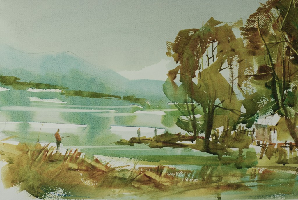 The second composition is one of my favorite ways to design a painting, using all of the subject matter as one big interesting shape that really moves across the painting. If the major shape is interesting enough the remaining white paper is a wonderful negative space and the design is really successful. Make sure your spend some time on the composition before you start and you have to leave the photograph aside or it will be way too confusing.
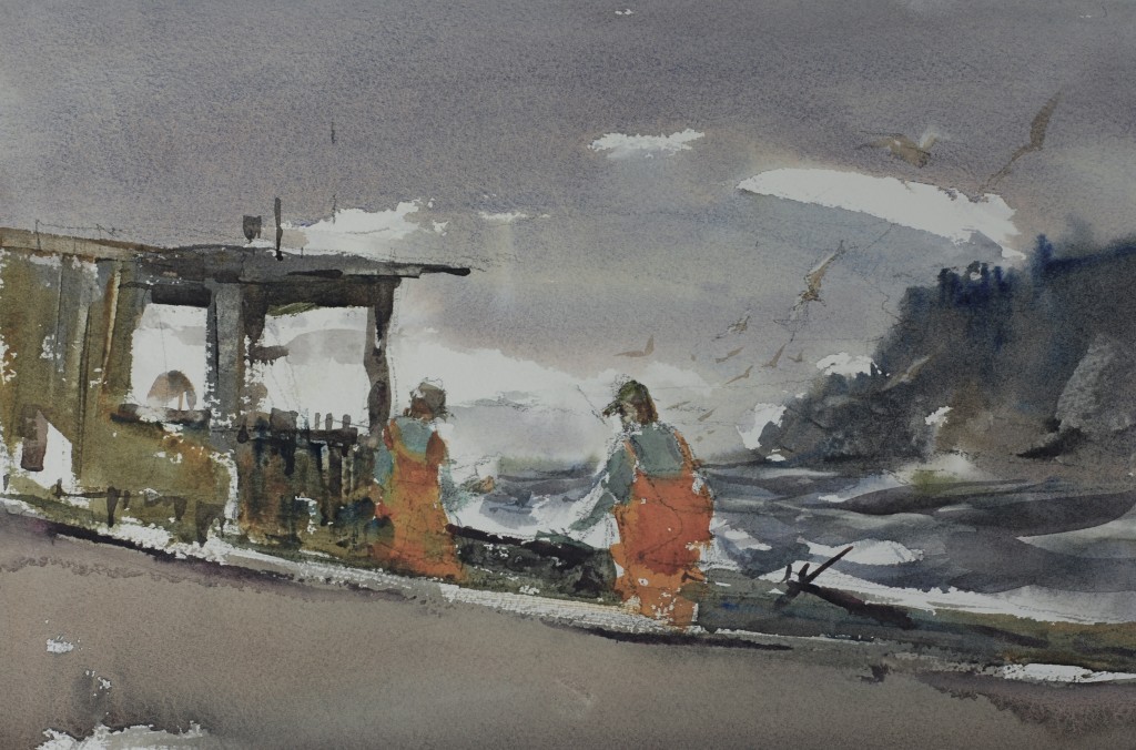
 This last piece is a dramatic light and dark composition made up from the desire to make the figures really doing something, in this case working a lobster boat off the coast of Maine. Again though, I am combining values so the figures really join up with the darker passages of the boat. I used the sky and water to force the center of interest to the point where the figures are located in the cabin. No ambiguous use of focus in this piece.
1 Comments on “In The Studio: Figures in the Landscape: Three new demonstrations”
Leave a Reply Cancel reply
This site uses Akismet to reduce spam. Learn how your comment data is processed.

Dear Steeve: Once again I am delighted after reading your new post. It’s really interesting, and although there are things I already know, comes great read them again and review them. I like your delicious paintings. Thank you for the brevity of the post and the not existence of too much links that branch them and wasting the fundamental topic thread. A million thanks for sharing with me. I try to share it with my friends. A respectful greeting