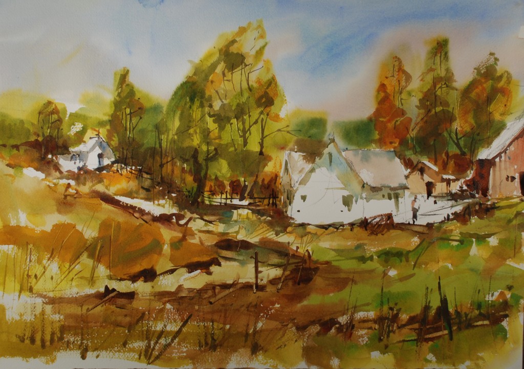
 This painting is going to require all of the skills that have been discussed over the last 42 paintings, crisp whites, expressive shadows, using the brush in creative ways, keeping your centers of interest the focal areas of the painting and working with colors in a fluid fashion. The movement in the painting starts with the slightly indicated road in the bottom left of the painting and moves up to the little house on the left and back across to the central houses. Put the texture, details and contrast where the viewer is supposed to look.
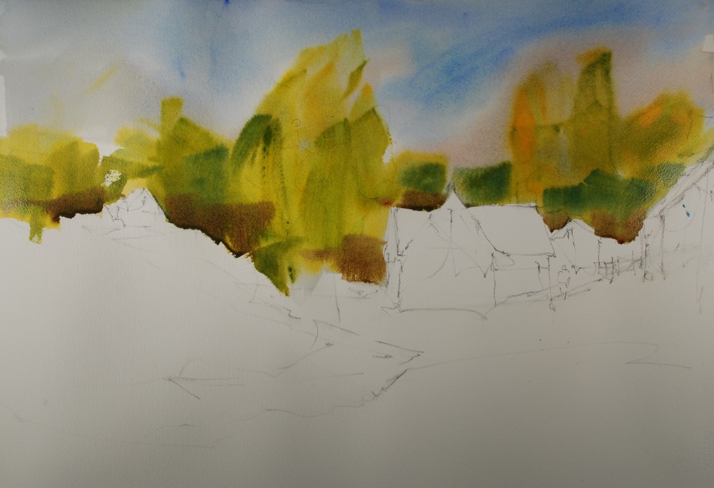 Cerulean and cobalt blue for the upper sky with a little bit of permanent rose worked in at the tree line, use a lemon yellow and new gamboge for the first layer on the trees and with the side of the brush pull down some bluish greens to create the foliage shapes on the trees. Put some burnt sienna into the mix at the bottom of the shape.
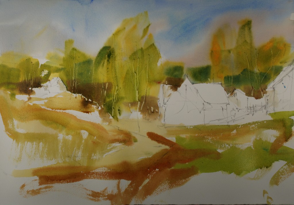 Move to the foreground with a large round brush a put in some really expressive weed like brush work using raw sienna, burnt sienna, and the green left over from the top trees. Remember the colors are only partially merged on the palette, not completely homogenized into a lifeless mud.
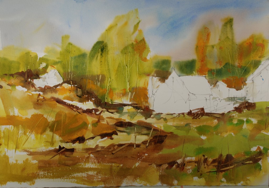 Run second layers on darker yellows, greens and browns over the foreground, creating a rough, scumble of weeds, rocks and posts, try to stay loose and free with your concern here. Punch in some darks with burnt sienna, rose, and ultramarine blue at the movement lines along the road and white shapes.
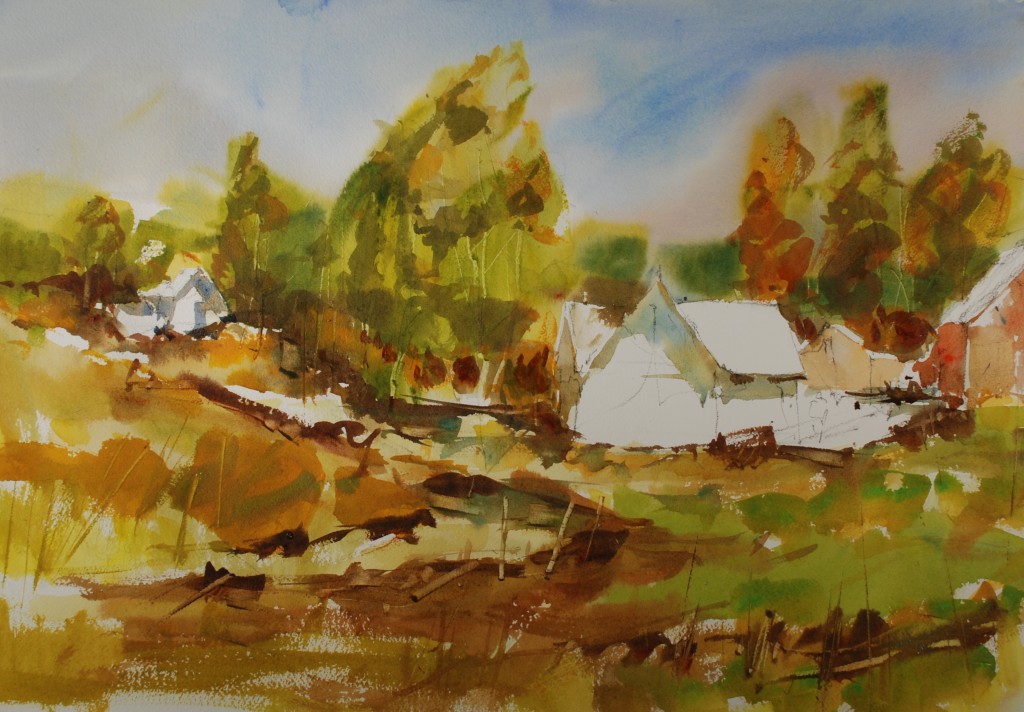 Mix a cool shadow color for the white building, I used cerulean blue with a little cadmium scarlet. I back washed a little raw sienna into the shadows to give the appearance of reflected light. I put a light brown and light red on the other two buildings and popped in some dark pieces under the trees to make the light more realistic.
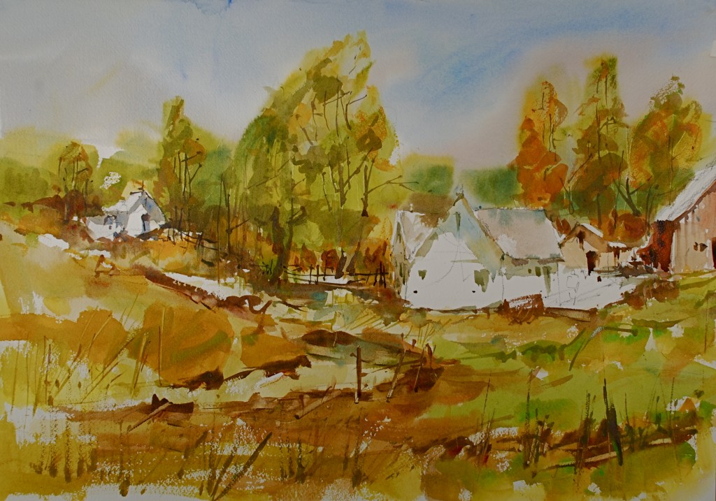 Using a fine liner brush and middle value colors I put in some more details and tried to not get too fussy. This is really the hard part to not go overboard with the details. The windows and doors are pretty much a darker version of each related shadow color, this will keep the shadows from jumping off of the paper.
 A few more details in the white shapes, figure and fences and shadows and it’s a wrap. I hope you are enjoying this project and if you are keeping up I am confident that your paintings are really improving. Let me know how its going.

What a beautiful landscape, Steve–thank you for posting it!
Nice, depth and warmth in the scene