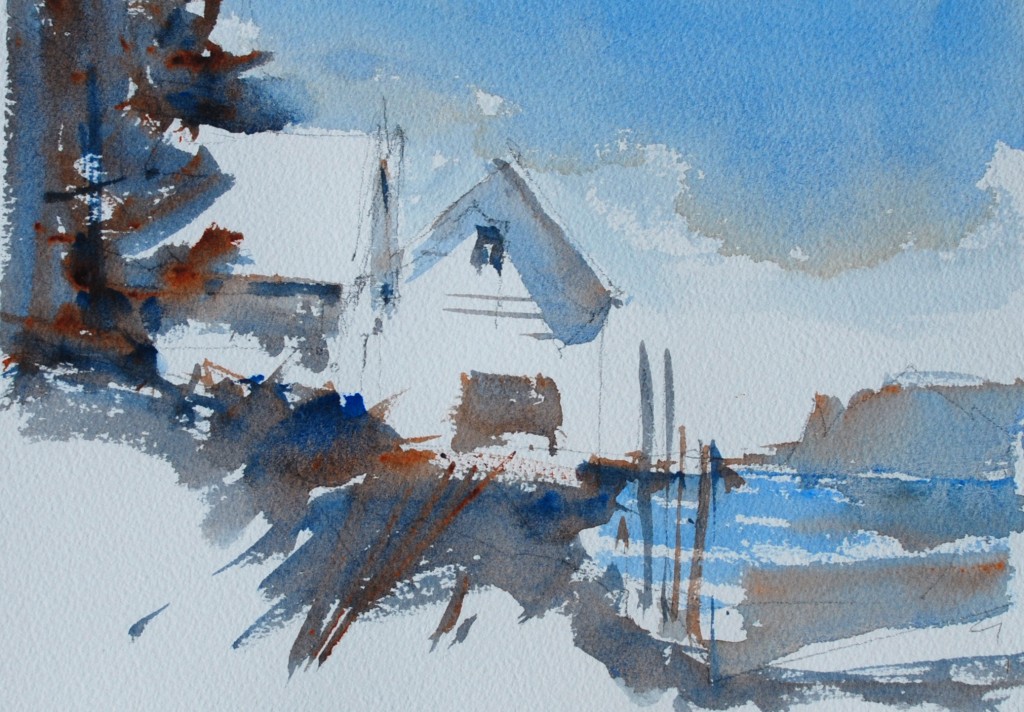
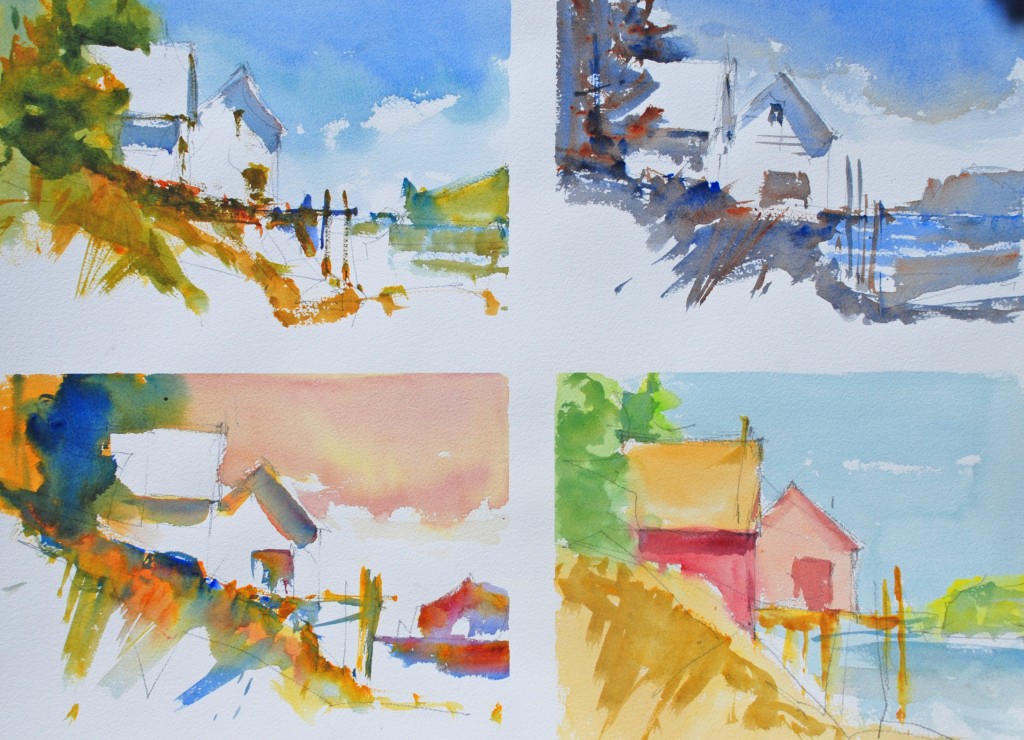
In this exercise use a simple straight-forward design with a well indicated light pattern. Do a value pattern and work directly from the value pattern. It will be really hard to work from a photograph since the goal is to make up the colors while still keeping the strong feeling of light source. Tape the paper, as we have before, make four quarter sheets. Lightly sketch in the shapes and use a couple of lines to show the boundaries of the light and shadows.  This is the sketch I am using. You will notice that I have added a little bit of dock and made the foreground much more of a white shape.
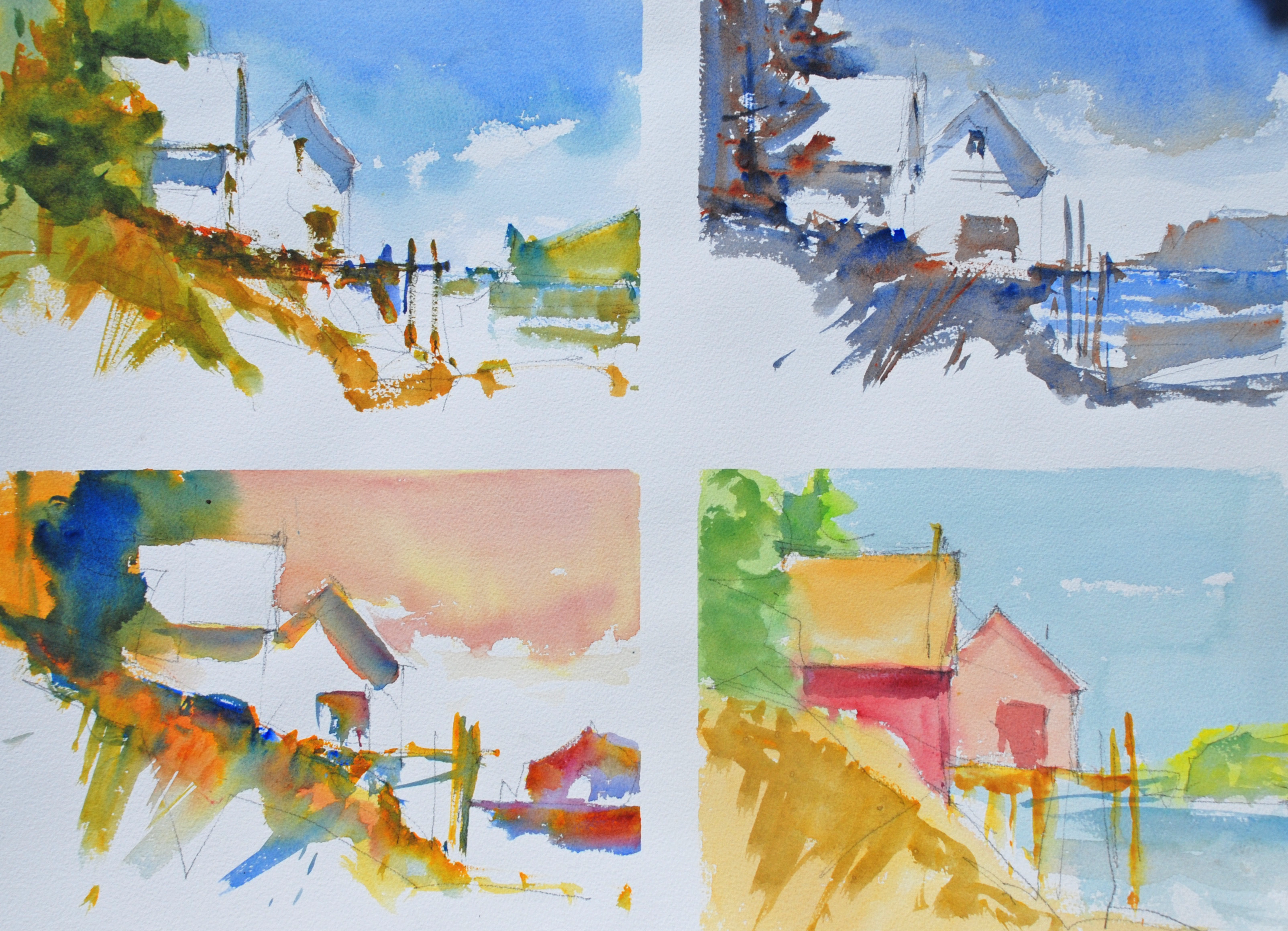
 This version has pretty conventional colors raw and burnt sienna, cobalt blue, New Gamboge, and olive green. I am trying to get some nice texture on the edges of the light and am applying the paint with the side of a round number 12 brush.
 In this version I am using Burnt Sienna and Ultramarine Blue and am working on preserving the light but also working on the intensity of contrast between greyed colors and their pure pigment.
 This version is painted using the perfect primaries of Alizirin Crimson, Cobalt Blue and New Gamboge. I let the colors mix on the paper to get a true primary palette feeling.
 This painting I am not leaving any white paper but am trying keep the feeling of light using warm and cool versions of the three primary colors. This is a fun version stick with it you will have a really great time unless you get too worried about it being too colorful. Remember art is supposed to be creative not a copy of nature.
 My page as it looked after my demonstration. Give this a try remember these are lessons to get going of painting and are not meant to be slaved over masterpieces. Use these to warm up.


What clever lessons/jumpstarts–Your demos are as fresh as ever! I love the variety of colors in each one.
These colors are wonderful-especially the strong blue in the third painting!
Super study about different ways to emphasize the light. Wonderful notes. Thank you for your generosity