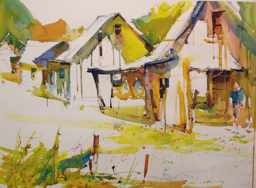
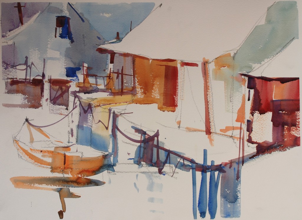
Watercolor is a wonderful medium, both transparent and opaque, but we really should try to use the white paper to create wonderful passages of light and movement through our paintings when we are using watercolor in a transparent fashion. 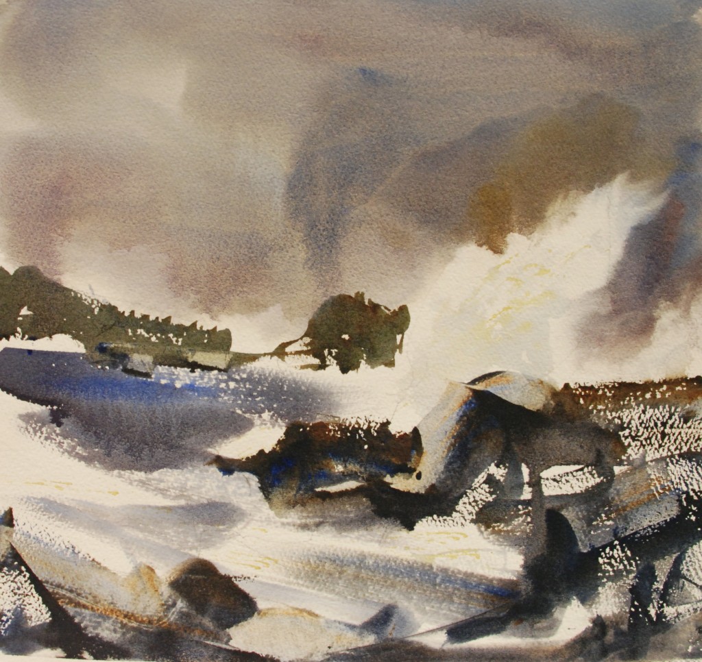 The pure white paper really screams look at me against vibrant colors, and textural accents. Make your most creative statements right at those points in your paintings where the white paper and color intersect. Try to make your white shapes be varied in size and direction and be attached in some way. Sometimes the attachment is not specific like holding hands but it is implied by the angle of the white shape or its’ position on the paper.
 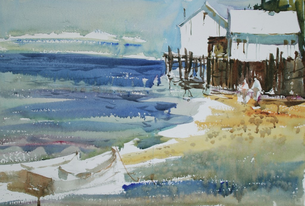 Think of how you will use the white paper before you begin to paint, try making a little sketch that breaks down the subject matter in to 3 possibly 4 values. Have fun, this requires that you look at the subject a creatively design it thinking white not existing color. Start first by making every plane facing the light a white shape and then make each white piece slightly different in shape, size, and angle.
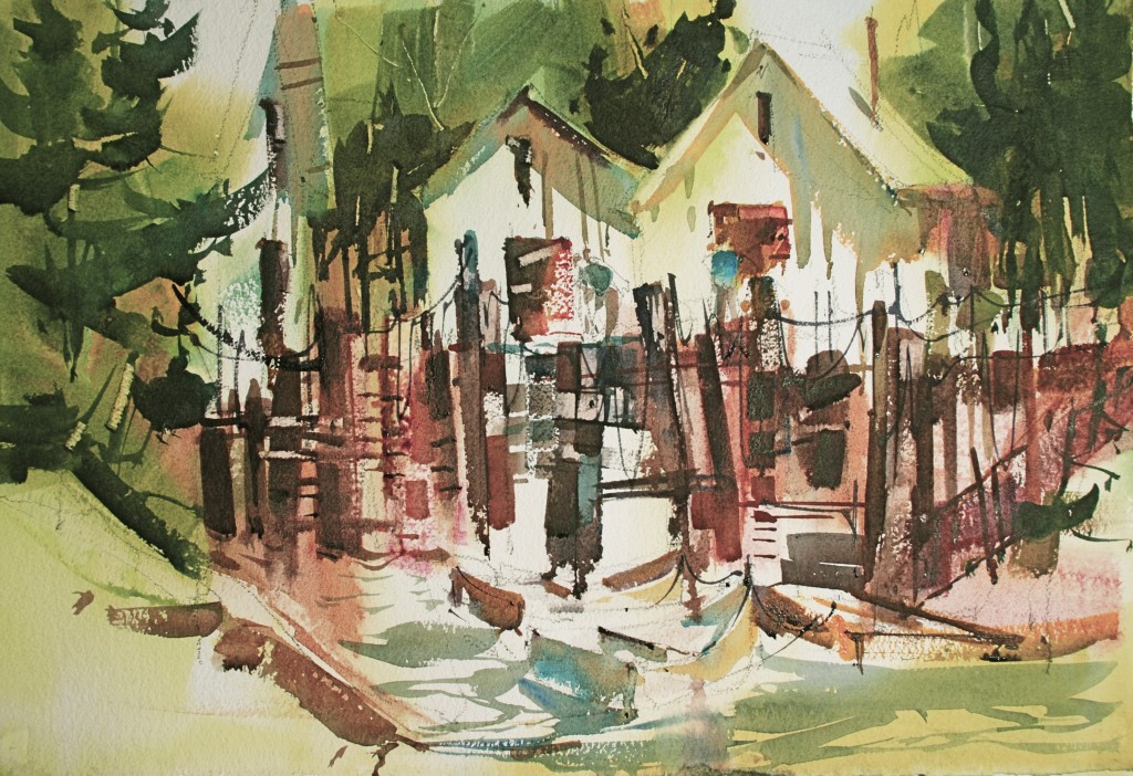 Keep the shapes really simple and leave everything facing the light white paper don’t always think realistic think creative and expressive, leave out everything that complicates the design.

. Thanks for sharing your knowledge. beautiful your paintings
I have done much to let go with watercolor, but since I do not understand much English and the translator of google is not as good I would understand what you say in this sentence.The pure white paper really screams look at me against vibrant colors, and textural accents. Make your most creative statements right at those points in your paintings where the white paper and color intersect. Try to make your white shapes be varied in size and direction and be attached in some way. Sometimes the attachment is not specific like holding hands but it is implied by the angle of the white shape or its’ position on the paper
The white space is dazzling without being intrusive! The composition/design, especially of the first and fourth paintings are mind-boggling, and the shadows….!
Thank you Steve. That’s what I can say. I’m leaving somewhere I don’t have access to classes and workshops and usually use internet to get instructions in watercolor. Yours have been the most creative, artistic and useful ones. I really enjoy them. And you are so generous in sharing your knowledge. As a retired teacher (and physician) I thank you!