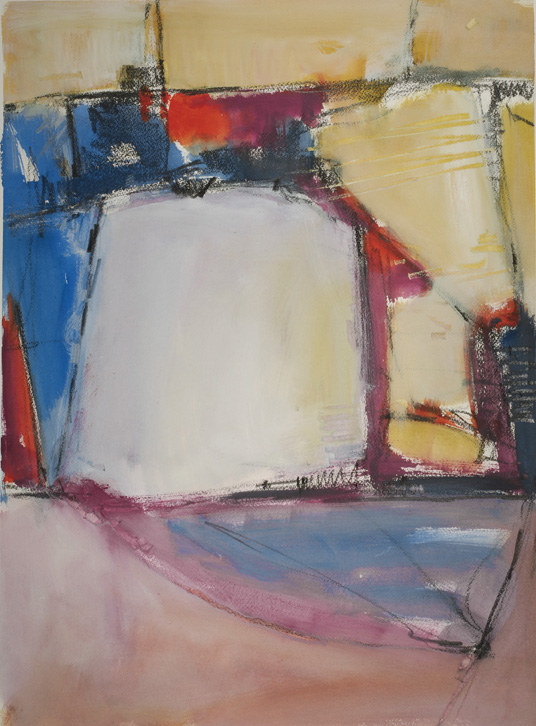
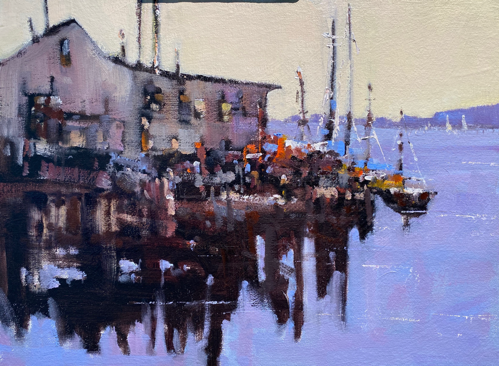
 In this painting I have worked on moving the viewer around the canvas by using a strong contrast of red orange/blue which is pretty dominant in a painting. I tried to use small pieces of the contrast and worked them against some colorful greys. My goal is not to make you move too fast but to leisurely take in the painting. If the color chords are too powerful and too large then the conflict is way too strong and there is not enough time spent in the painting to savor the other pieces of the work. Try to make all pieces of the painting important and worthy of being included. It will make your paintings stronger and give the viewer more time to enjoy your work.
Artist Studio

